Pairing Rapid Prototyping with Wireframes and UI Design
Using rapid prototypes to explore and test new interactional models with Nevro patients.
Project Overview
This case study details the user experience (UX) design process for the Nevro Patient Therapy App (PTA) and Pathfinder applications. Developed in collaboration between Karten Design and Nevro with Velentium as the development partner (they replaced Orthogonal several months into the process due to ineffective communication and lacking the skills needed to bring this product into reality), these applications aimed to provide patients with enhanced control and insights into their HF10 implant therapy. The project focused on creating intuitive interfaces for managing stimulation, tracking progress, and receiving personalized recommendations.
Note: Nevro has changed the “HF10” name to “HFX.”
Project Duration: Feb 2018 – October 2018
My Role
- Sr. UX Designer (owning the end-to-end design process)
- Research facilitation
- Information architecture
- Wireframes and prototypes
- Content inventory and documentation
Team Members
- Project Lead
- Sr. UX Designer (myself)
- UI Designer & Sr. UX Researcher
- Project Manager
Design Process
Our design process was iterative and collaborative, comprising of an initial 3-month design sprint followed by six bi-weekly sprints. We had weekly reviews for continuous feedback from Nevro and Orthogonal (later Velentium). Key phases included:
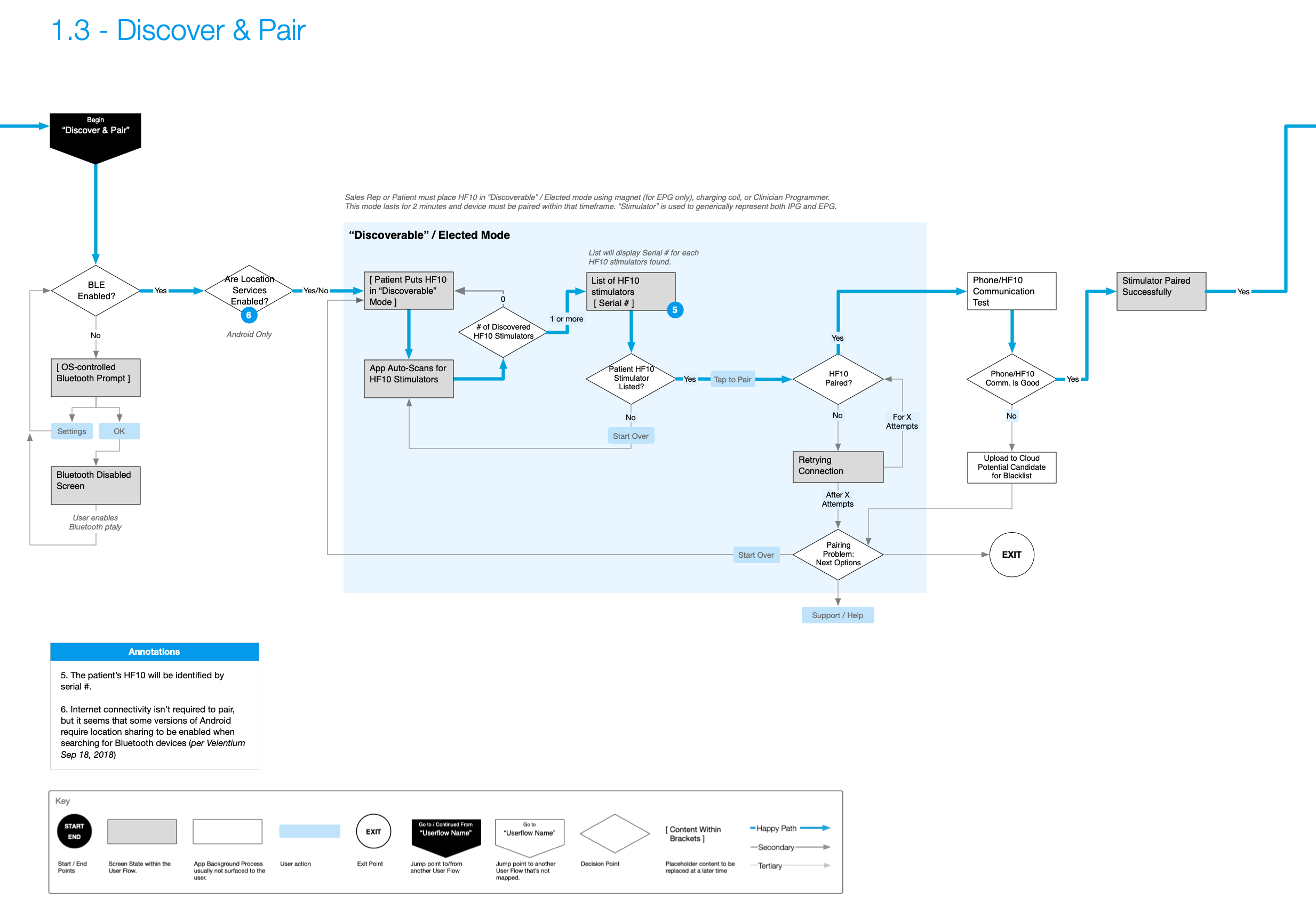
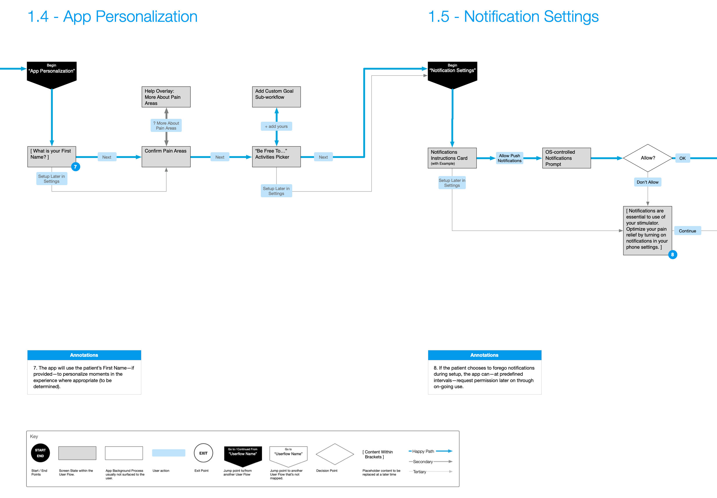
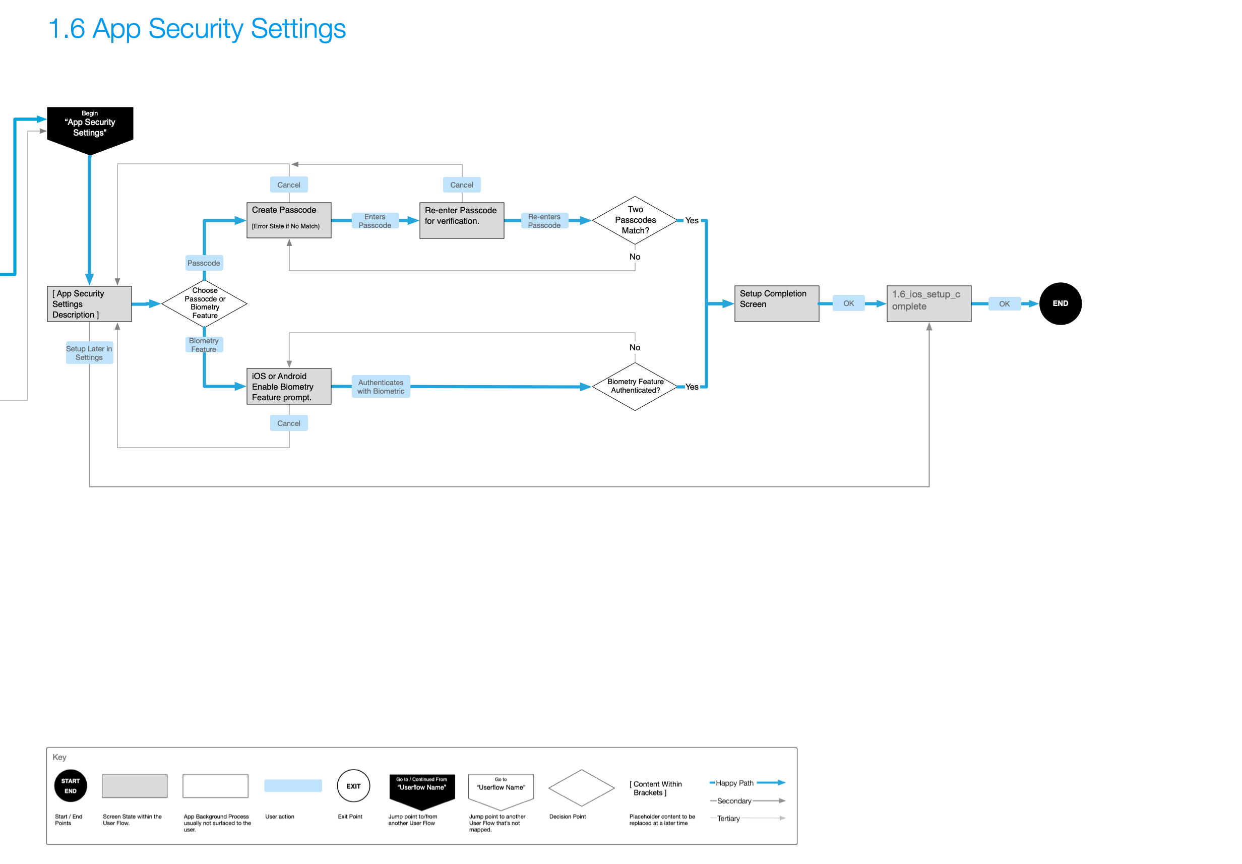
- Information Architecture (IA), Application Maps, and User Flows: Defining the high-level structure and navigation for both PTA and Pathfinder to ensure a logical flow for users, and further defining the step-by-step interactions for critical features— from first-time setup, to daily use, and advanced settings.
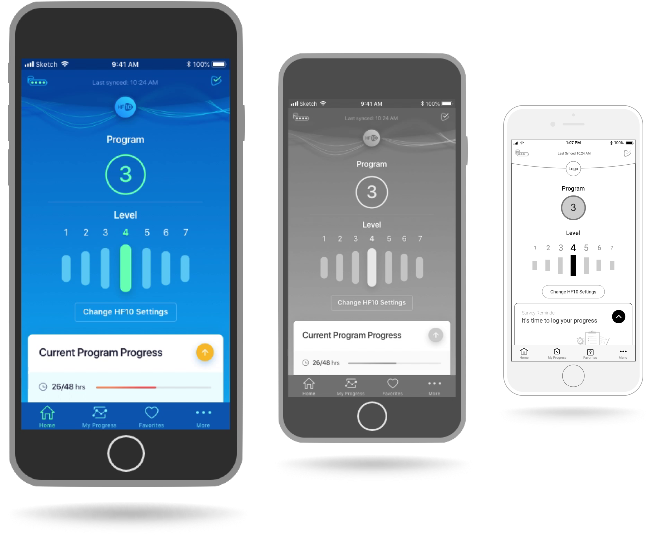
- Wireframing & UI Design: Creating low-fidelity visual representations of each screen, focusing on layout, content placement, and interaction elements. Myself and a UI Designer worked in tandem on wireframes and visual designs, respectively, for each sprint.
- Prototyping: Creating prototypes to explore, visualize, and test new and unique interaction models related to changing device settings and other features throughout the wireframing process.
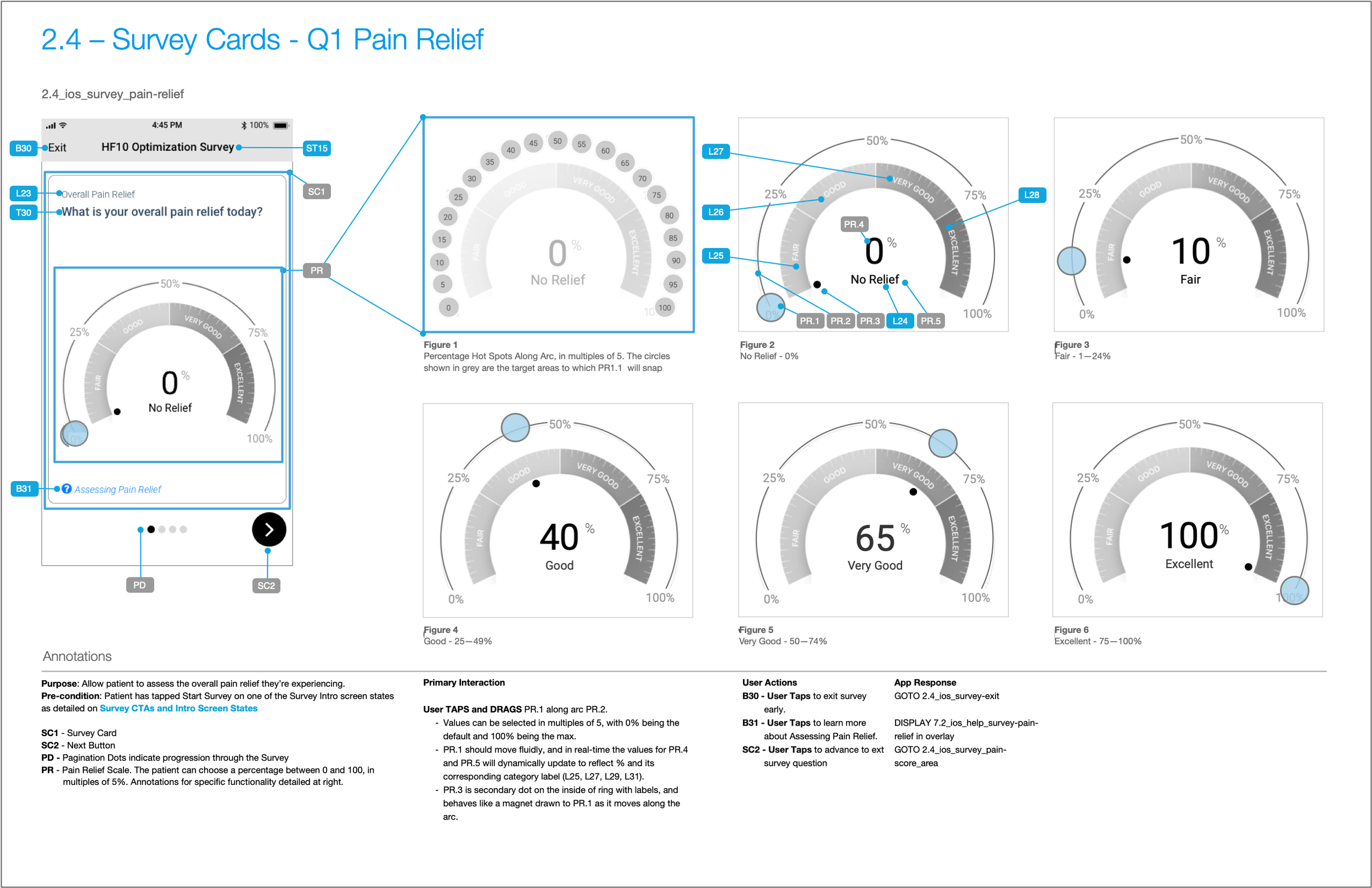
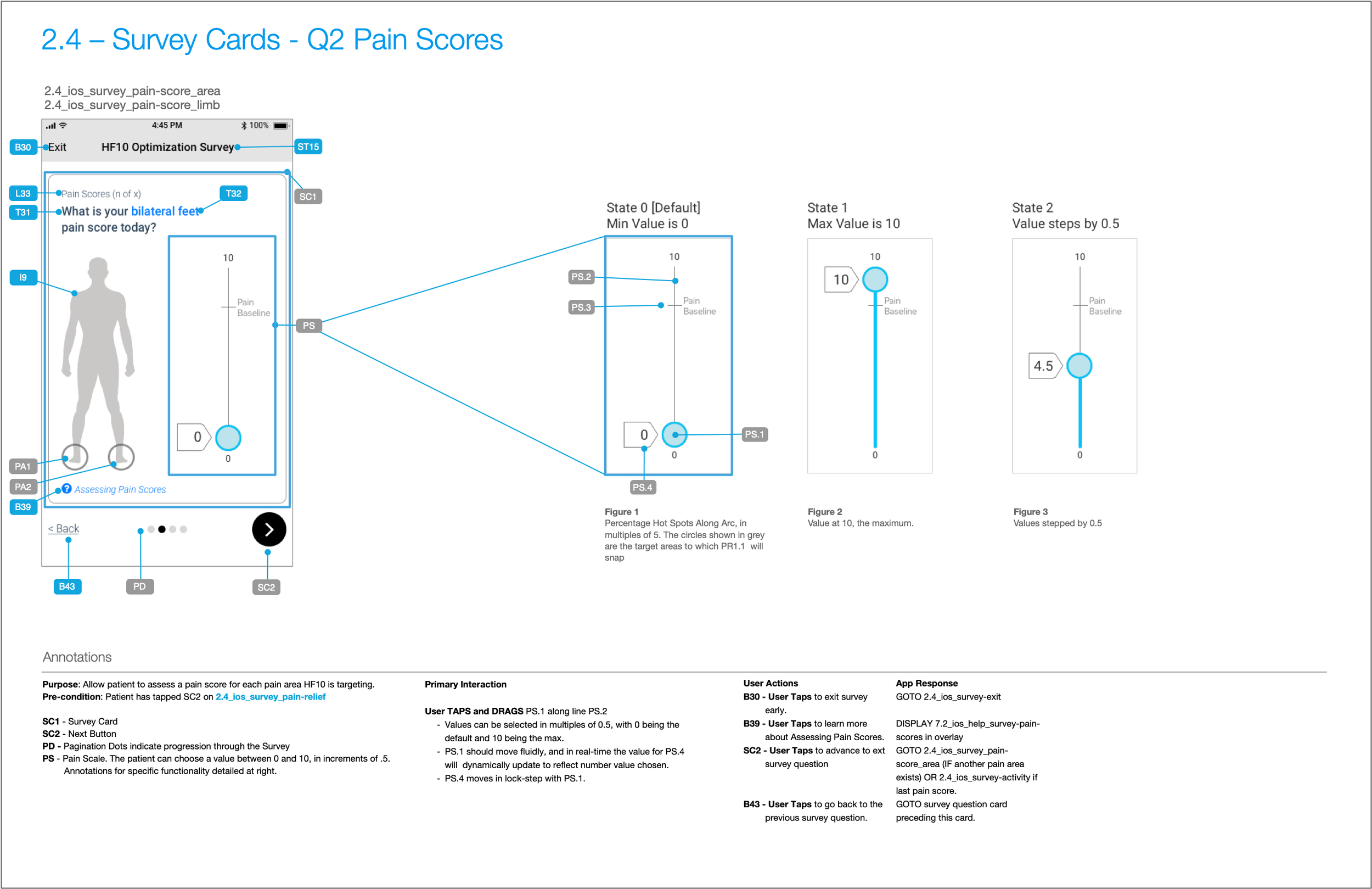
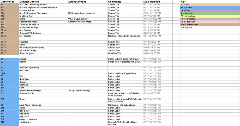
- Annotation & Content Inventory: Used a numbered annotation marker system to document functional and interaction details, as well as linking to a comprehensive content inventory spreadsheet that was used as the “source of truth” throughout the project.
Lingering Challenge: “One App to Rule Them All”
Patients using the Nevro HF10 implant for pain management needed a seamless and empowering digital tool to interact with their therapy, and Nevro wanted a way to turn these interactions into actionable and historical data. From the start, the client had envisioned two distinct apps:
- Nevro PTA (Patient Therapy App): A manual control app mirroring the Patient Therapy Remote (PTR) with added features for pain surveys, progress tracking, and favorites.
- Nevro Pathfinder: An automatic therapy optimization app that suggests new program settings based on patient data, offering a more hands-off approach while still allowing for adjustments within saved favorites.
Both applications required a robust, user-friendly interface that could guide patients through initial setup, daily therapy management, and data-driven insights, all while ensuring patient safety and data privacy.
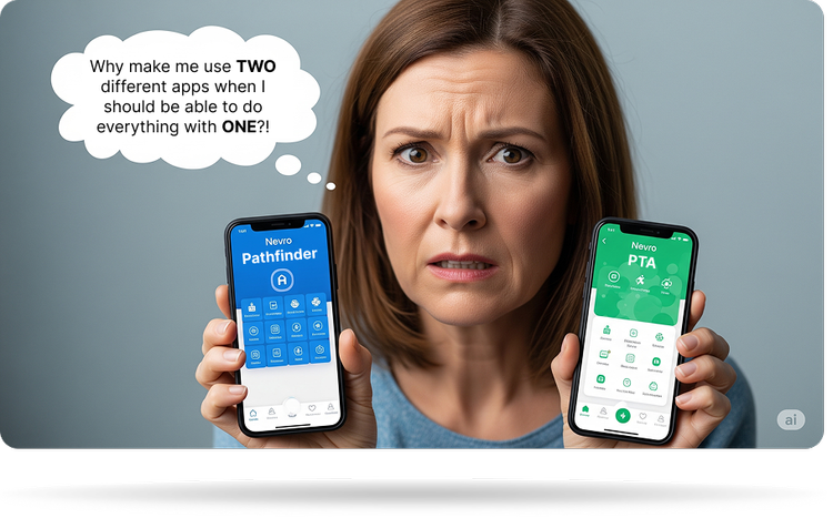
This is what Nevro said they wanted, but deep-down, our team knew that having two different apps would be a bad strategy, not just because patients wouldn’t want to have to download two different apps, but because it would be confusing as to which one did what, and why.
It would also be costly to Nevro down the road since they’d be maintaining two different code sets, marketing two different apps, and then spending a lot of customer support time explaining the difference. It would just be a massive headache.
We provided specs and application maps for two different apps, but ultimately they took our advice and released just one app.
Key Design Principles
- Simplicity: Ensuring that complex medical device interactions were presented in an easy-to-understand manner.
- Patient Empowerment: Giving patients control over their therapy and rewarding them with meaningful insights as they completed pain surveys and journaled their results.
- Accessibility: Ensuring compatibility with screen readers was imperative not only because it’s the right thing to do, but because it was required for FDA certification.
First-Time Setup: Onboarding & Device Pairing
The initial setup flow was critical for a smooth patient onboarding experience. This included:
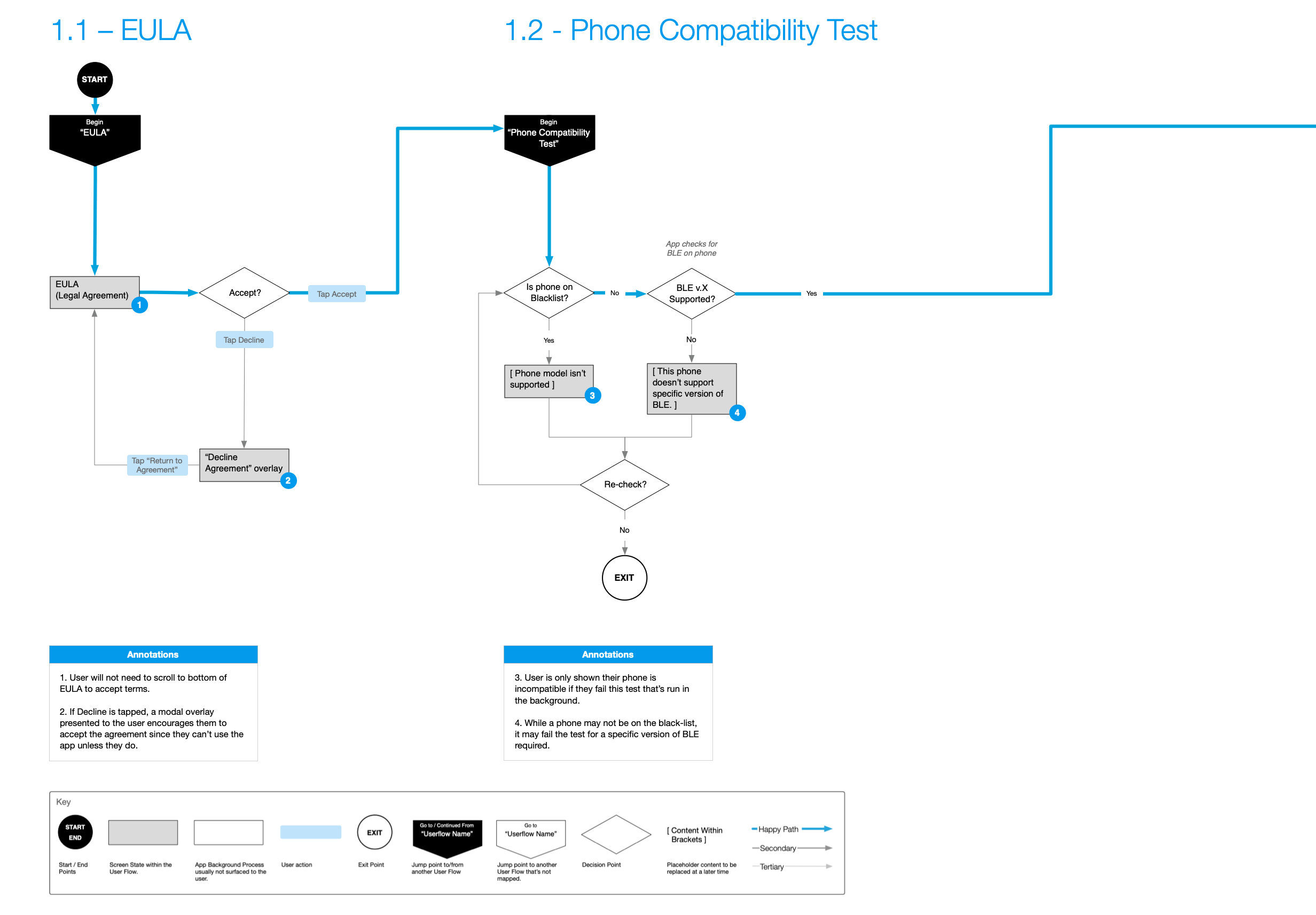
- EULA User Flow – Designed to ensure users understood and accepted the terms, with a modal overlay prompting acceptance if declined.
- Phone Compatibility Test – A crucial step to ensure the patient’s device could properly interact with the HF10 implant.
- Discover & Pair – The process for connecting the patient’s phone to the HF10 implant.
- App Personalization – Allowing patients to personalize their app experience by providing their name, confirming pain areas, and selecting activities they wish to “…be free to…” do again.
- Notification Settings – Configuring how the app delivers important alerts and reminders to the patient.
- App Security Settings – Allowing patients to secure their app with a PIN or biometric authentication to prevent accidental changes to therapy settings.
User Flows
Use the arrows below to see all six onboarding user flows.
Prototype: Onboarding & Device Setup
Here’s a video walkthrough of a basic prototype that I did early on in the project as my team was designing the Onboarding and Device Setup userflows.
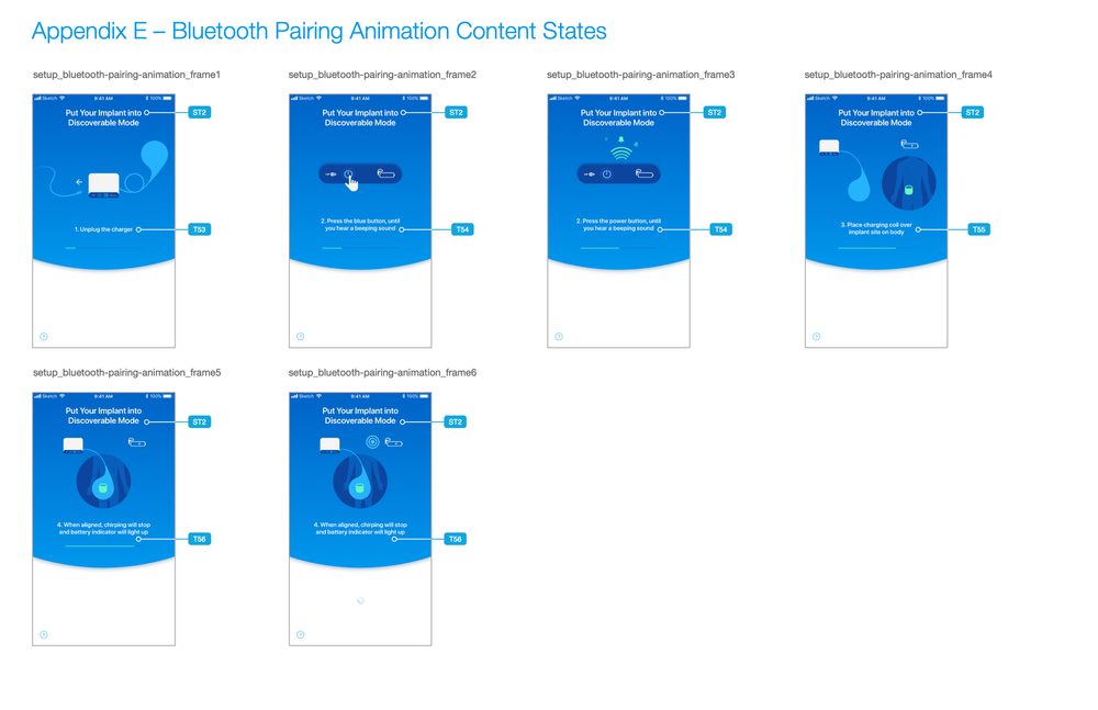
From Prototype to UI/Visual Design
After conducting tests with the prototype above, our UI Designer could create visual designs and animations that would assist the patient in pairing via bluetooth. Those are shown below.
Daily Use: Core Functionality
The core of the application revolves around the home screen, where patients can easily view their status, turn stimulation on or off, and adjust their therapy settings. The design prioritizes clarity and immediate access to the most frequent tasks.
Turning Stimulation On & Off
This prototype details the process of turning stimulation on and off, including the drawer interaction, options to change HF10 settings, and proposed transitional animations while changes are being transmitted and confirmed by the device.
That last point is important to elaborate on. There is a noticeable lag between the app sending program adjustments, the stimulator changing its state to match the requested parameters, and then sending a success/failure message when finished. Therefore it was important for the UI to clearly communicate these transitional states.
My Progress – Data Visualization and Interaction Models
To encourage patients to provide feedback through the surveys means we needed to provide them with meaningful and actionable data visualizations of their pain relief journey.
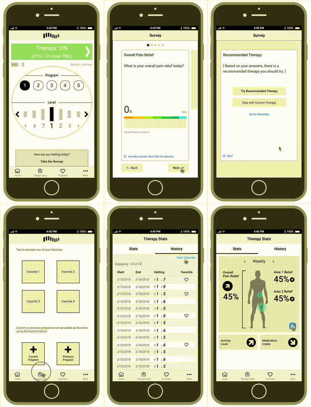
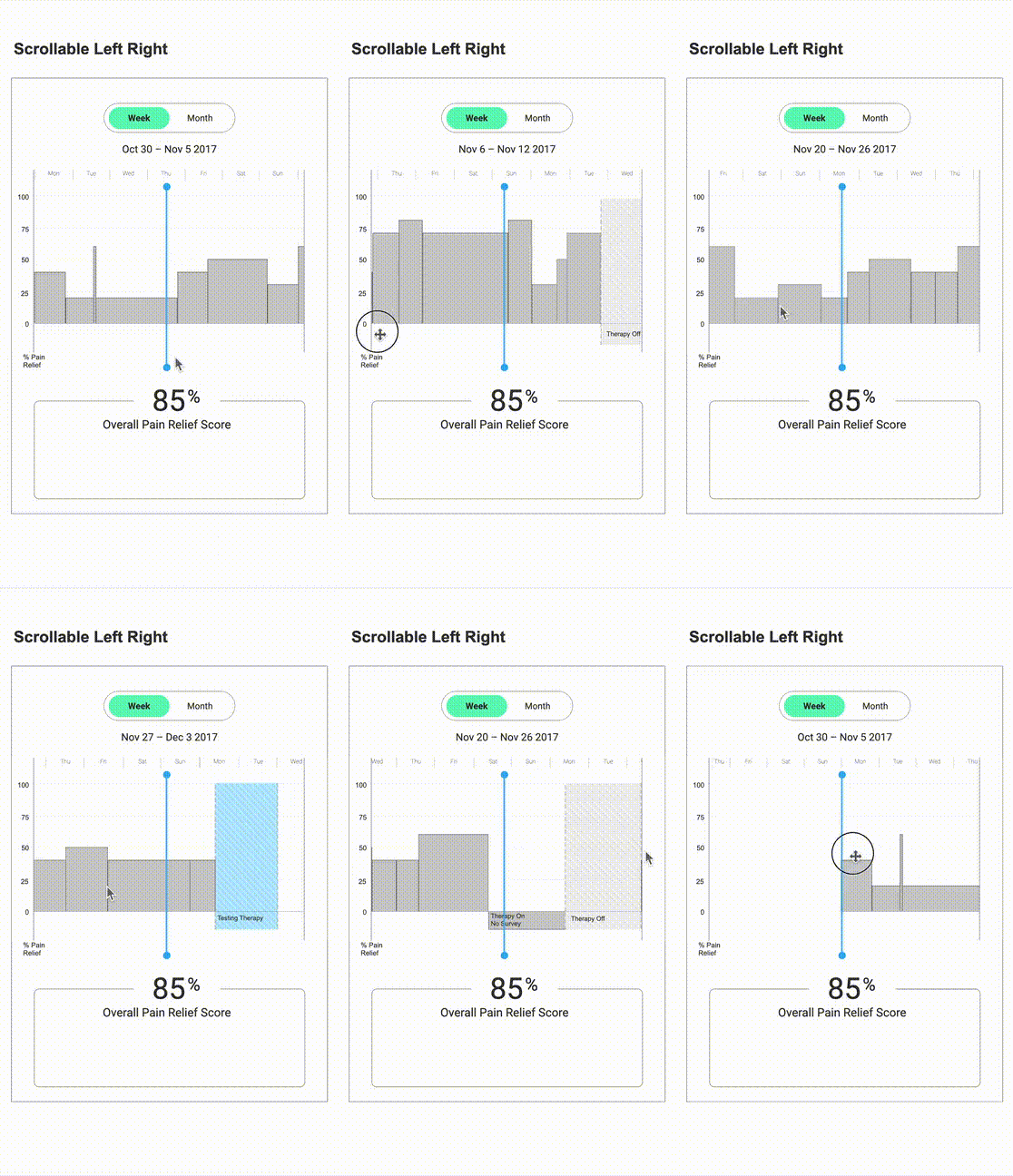
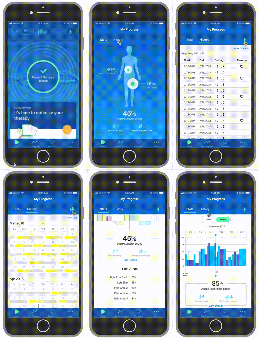
The animations below show quick sample click-throughs of three distinct prototypes that I created at various points in the design phase. They allowed us to get valuable feedback on interaction models and data visualization styles, even with a mix of low-fidelity wireframes, higher-fidelity comps, and placeholder data.
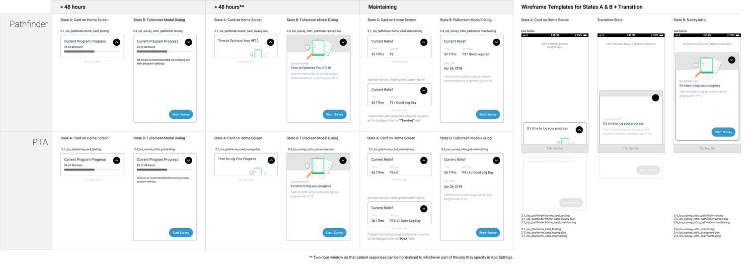
Home Screen States & Prompting for Survey Feedback
The home screen uses a dynamic status card system to show the most relevant information, such as the current program being tested, an active favorite, or a prompt to take a survey.
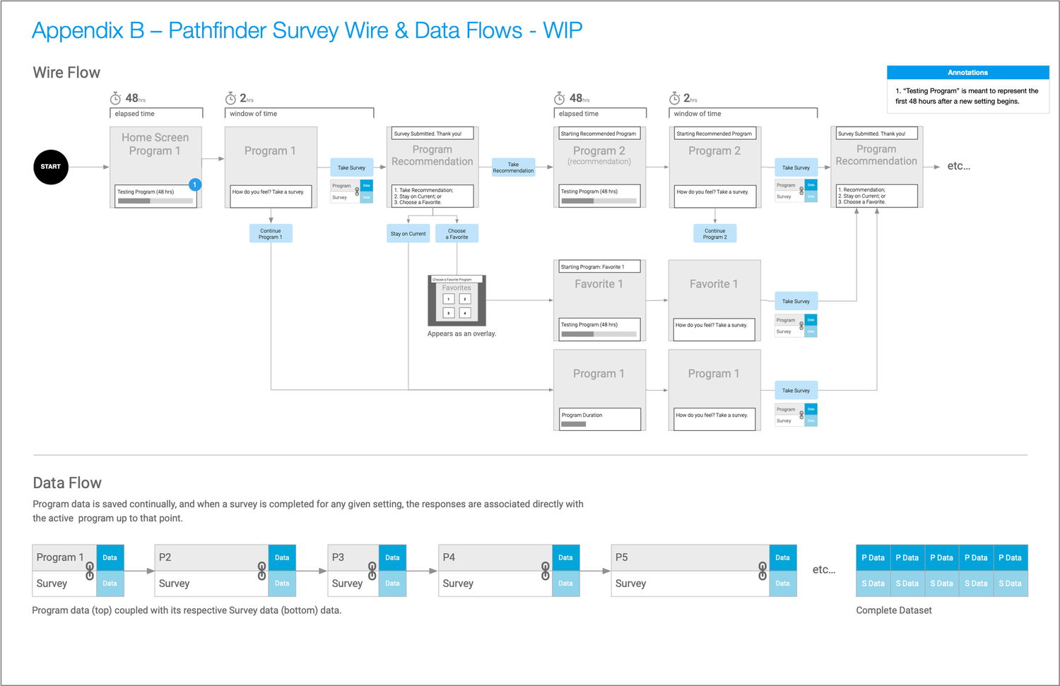
Even though they’re listed as Appendix B & C, it was necessary to work through—at a high-level—what the wireframe and data flows.
For context, it’s important to note that with a spinal cord stimulator, it’s not something that’s responding instantly to program/level changes; this is especially true for the first month or so after surgery. When a program/level change is requested for the first time, there is a 48-hour “wash-in period” (phrase used by the client) during which the stimulator would initiate the change and in response the patient’s level of pain would be affected.
In this first month, Nevro wanted to make sure the patient had time for the program/level’s efficacy to take hold before prompting feedback via the survey. This is represented below under the 48 hr time window in the first column. Once that window of time has elapsed, the patient is prompted to take the survey via the app’s home screen (and also via notifications if they’re not in the app when that condition takes place). To ensure timeliness of feedback, they’re given a 2-hour window to take the survey.
Survey Wire & Data Flows
Home Screen States Diagram for Survey CTAs
Survey Wireflow
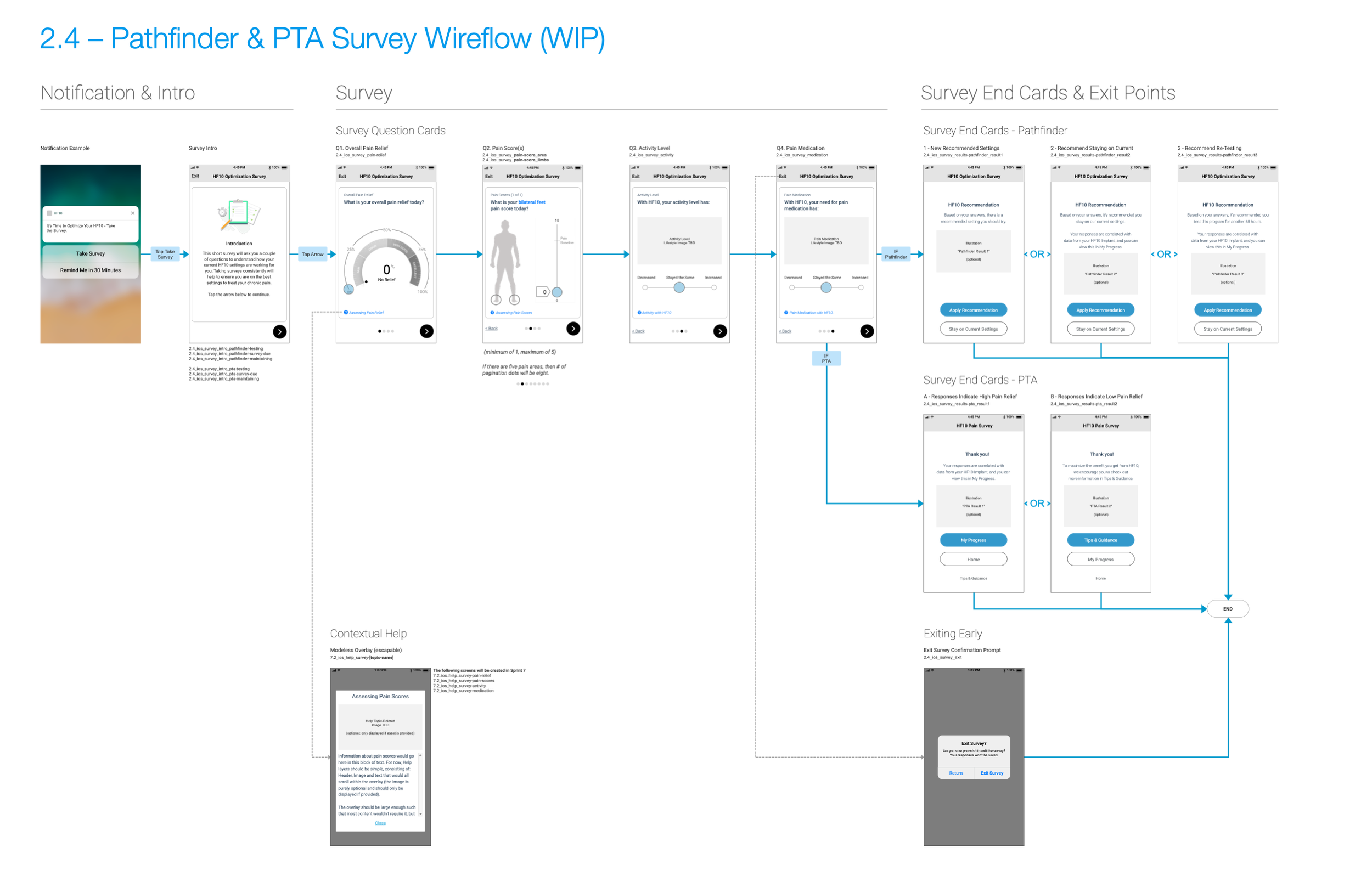
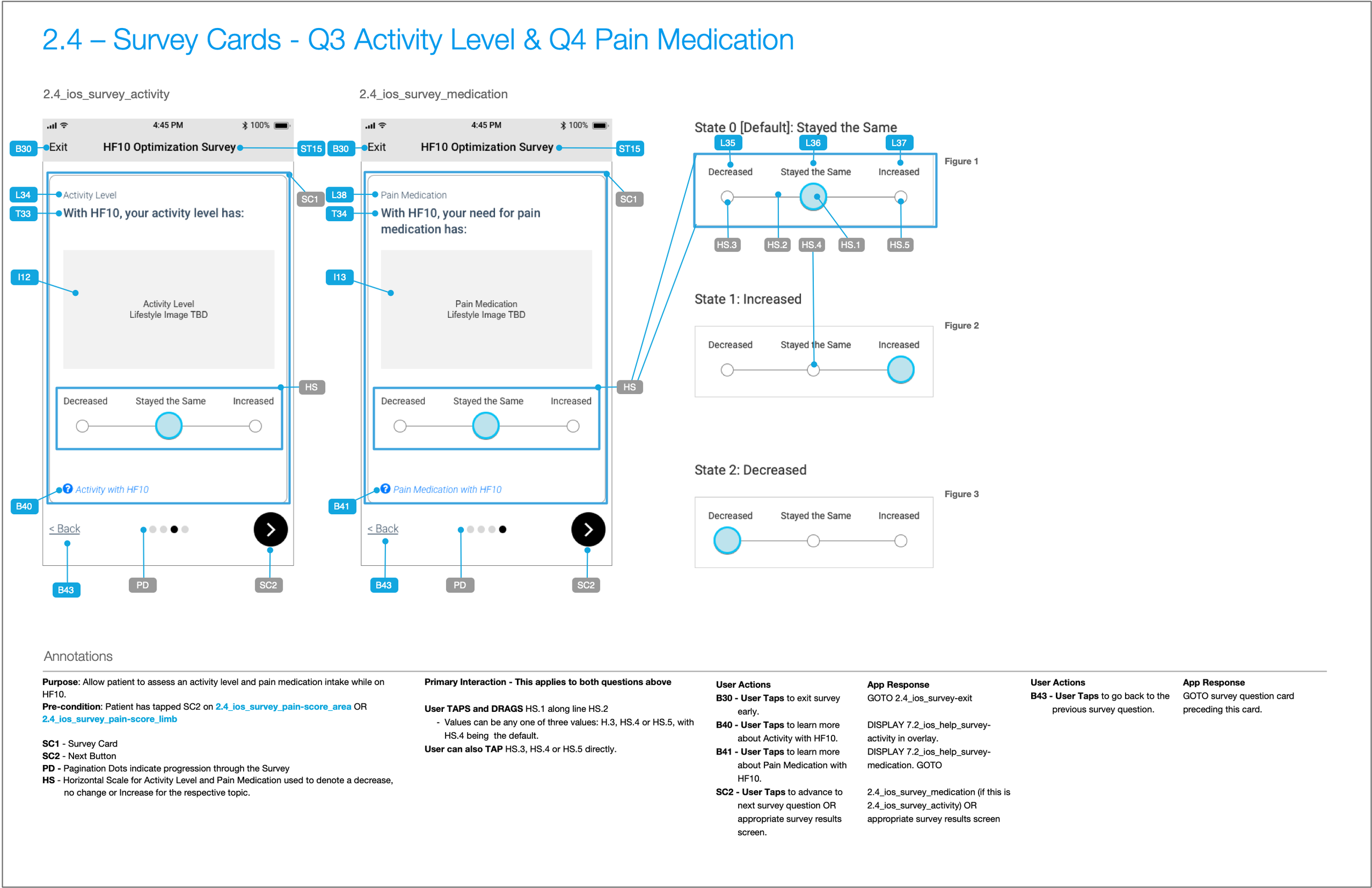
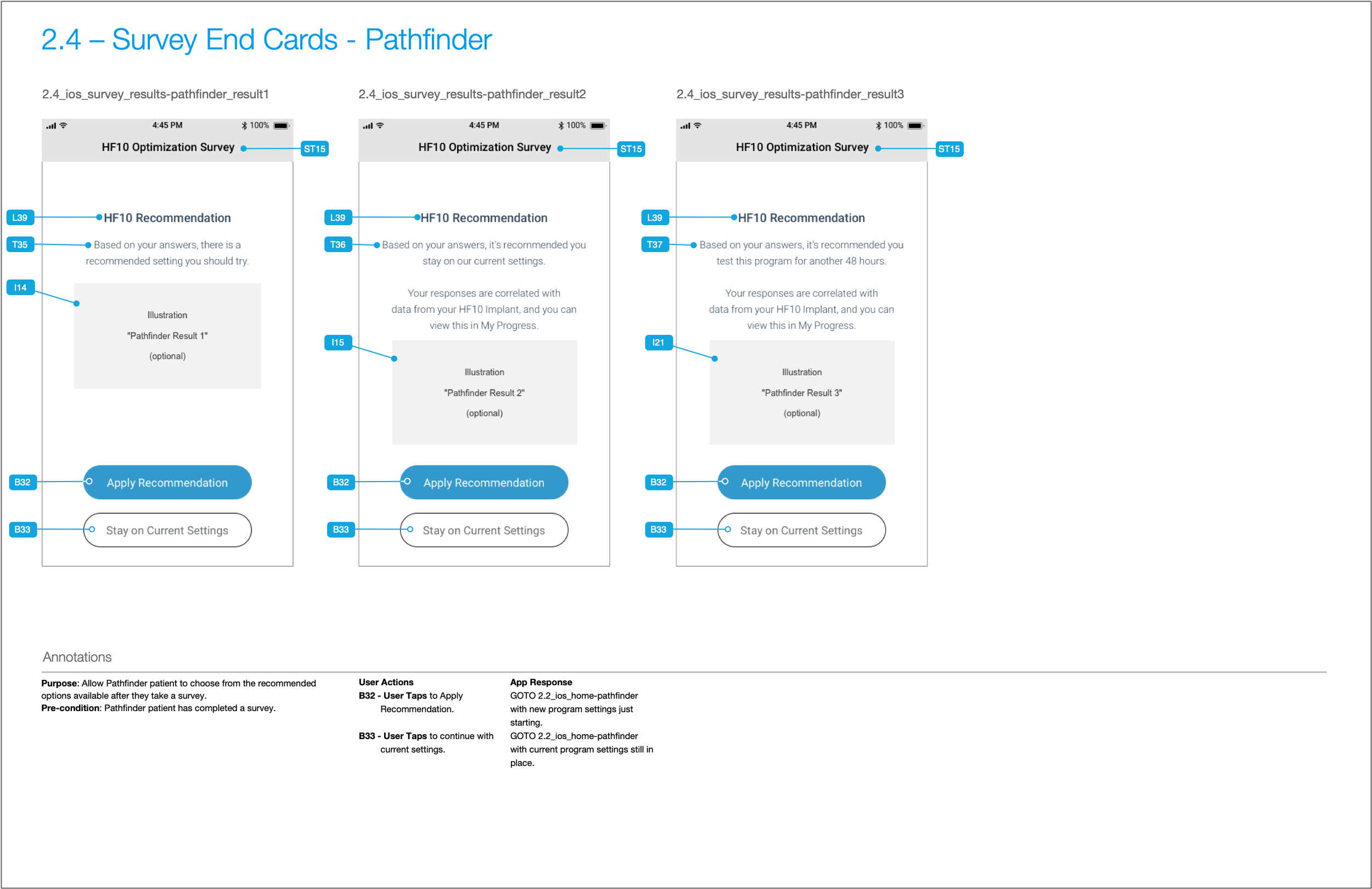
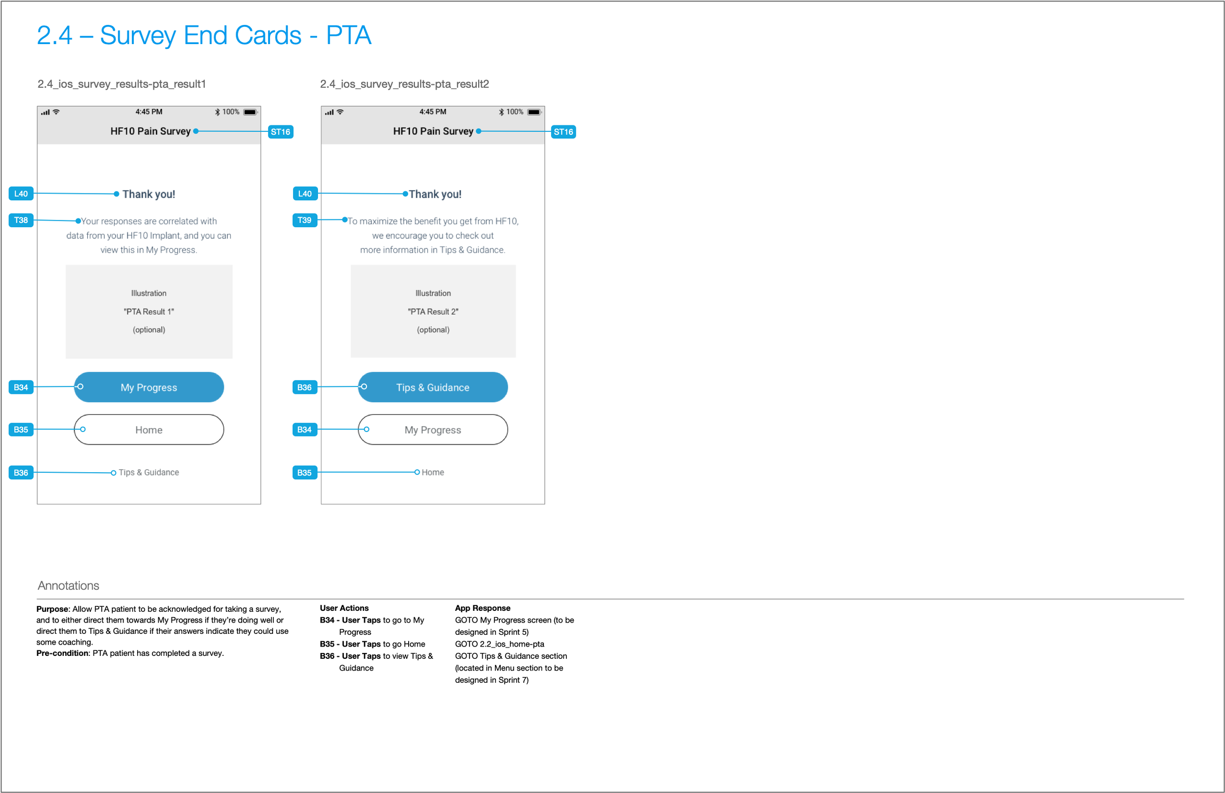
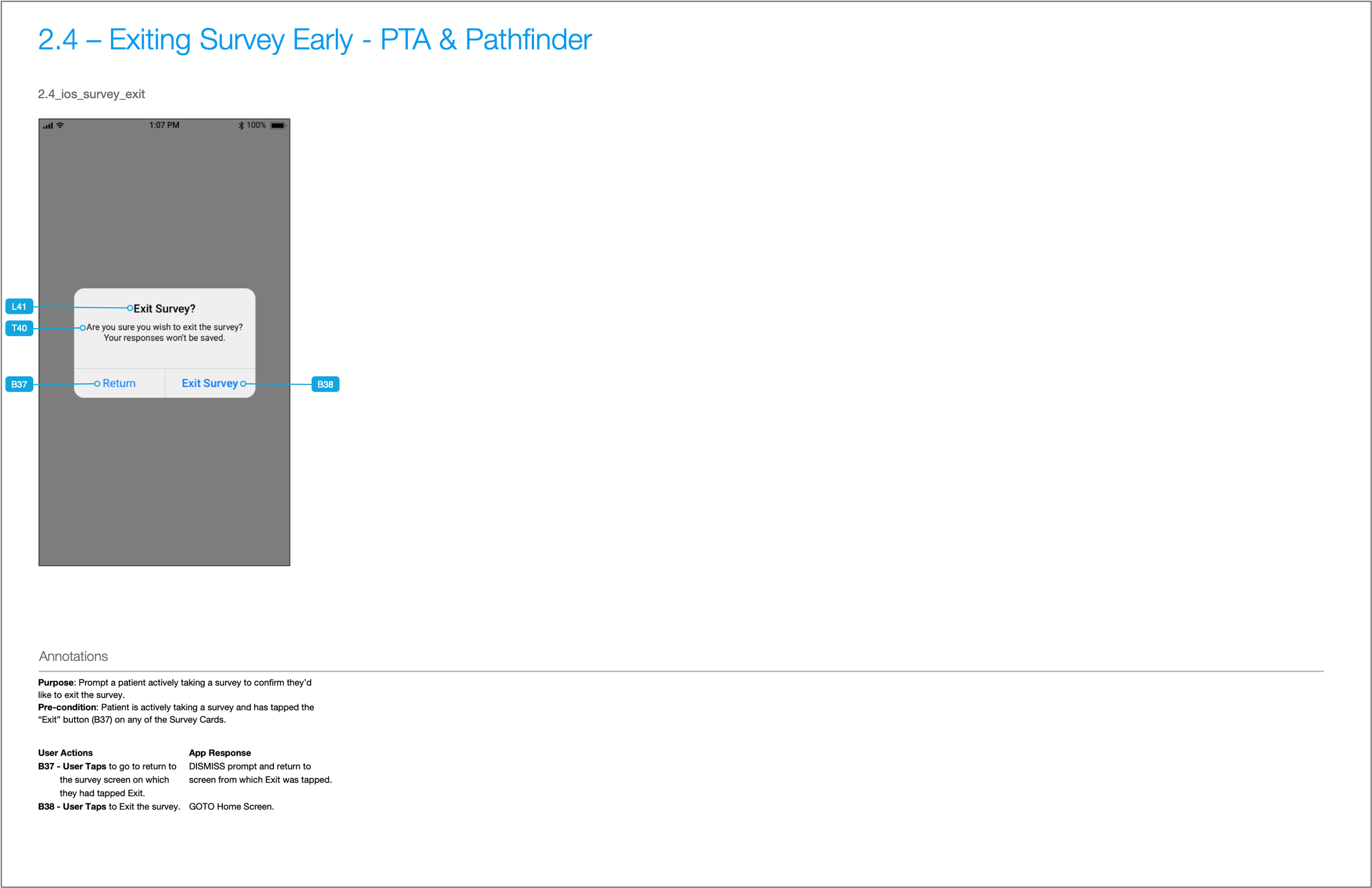
Survey Cards: Questions 1-4 + End Cards and Exiting Survey Early Confirmation
Battery & Connectivity
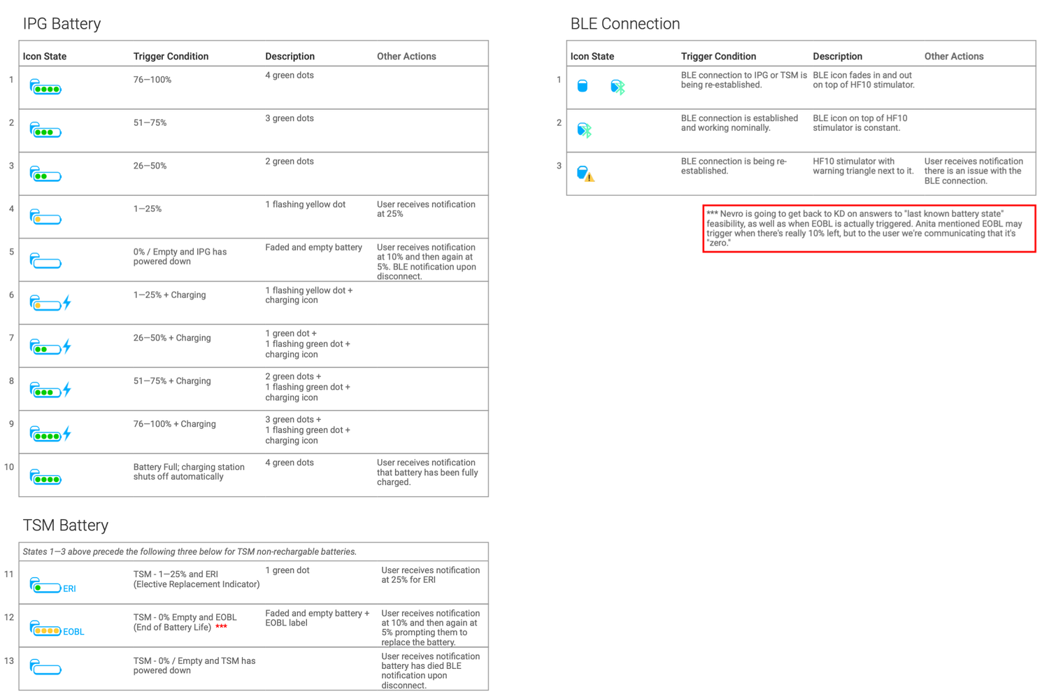
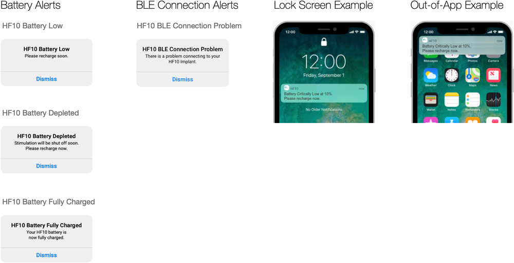
Critical system states like low battery or a lost Bluetooth connection are communicated through clear in-app alerts and system notifications.
Documentation, Annotations, and Content Inventory
As the design phase progressed, we were becoming overwhelmed with copy change requests the client wanted for prior sprints. This quickly became a bottleneck, because it meant having to update past wireframes, prototype screens, and visual designs.
I proposed that we start using a simple version of a content inventory, comprised of a spreadsheet which would act as the source of truth for all copy/content in the app that would be shared with the client. Each line in the spreadsheet would have its own unique content ID, which in turn would have a corresponding content tag in the wireframes.
After implementing that system, we could refer the client to the content inventory. And when development began, this system made their jobs easier since there was a single source of truth that also formed the foundation for integrating a CMS down the road.
Throughout the project, nomenclature—labels for navigation sections, action names, and other information—evolved as our team gained knowledge and conducted interviews. More broadly, the goal with information architecture and nomenclature is to have a solution that employs a mental model to which a patient or any user can easily relate.