Streamlining EP SmartStart for TV & Film Productions
Roster List and Crew Drill Down
Introduction
A Case Study on the complete UX Redesign of EP SmartStart’s core features — leveraging data-driven insights learned from the UX Research phase that wrapped up just one month prior.
Summary of Research Efforts
The research methodology used to gather user feedback and pain points on the existing SmartStart platform included moderated interviews and the creation of an experience map. EP contracted with a 3rd party — Philosophie — to run these activities.
- Moderated Interviews: Researchers conducted a total of 39 moderated interviews with EP stakeholders (12), client users (19), and crew users (9) to understand the issues with the customer experience with SmartStart, SmartTime Classic, SmartTime Mobile, and Support.
- Experience Map: Based on the interviews and product walkthroughs, an experience map was created to document the end-to-end customer experience, which helped to identify key pain points and opportunities for improvement.
Please note: While I didn’t run the research phase of this effort, I sat in on many of the interviews and used the findings prepared by Philosophie and our UX Researcher to prioritize issues and ultimately inform my design decisions.
Goals
We wanted to reduce the friction points and completely redesign two screens that were the most highly-used in SmartStart: Roster List and Crew Drill Down. The Roster List contains Crew Member Offer Cards containing top-level details, actions, calls-to-action for a respective offer; the Crew Drill Down details every single term within that offer. Based on the research, I was going to be focusing most of my efforts on the following friction points:
- Search, Filter and Sort UI + Microinteractions
- Iconography and Approval Chain Status
- CTA (Call-to-Action) Buttons
- Inconsistent Information States
I got into more detail on these in the next section.
My Responsibilities
- Redesign Roster List and Crew Drill Down
- Leverage research insights to resolve friction points outlined above and inform design decisions
- Apply UX best practices
- Re-think the overarching interaction model and navigation within and between these two screens
- Optimize underlying information architecture
My Team
- Sr. Product & UX Designer (me)
- Product Manager
- Product Owner
- Developers & Engineers
- QA Engineer
- Stakeholders
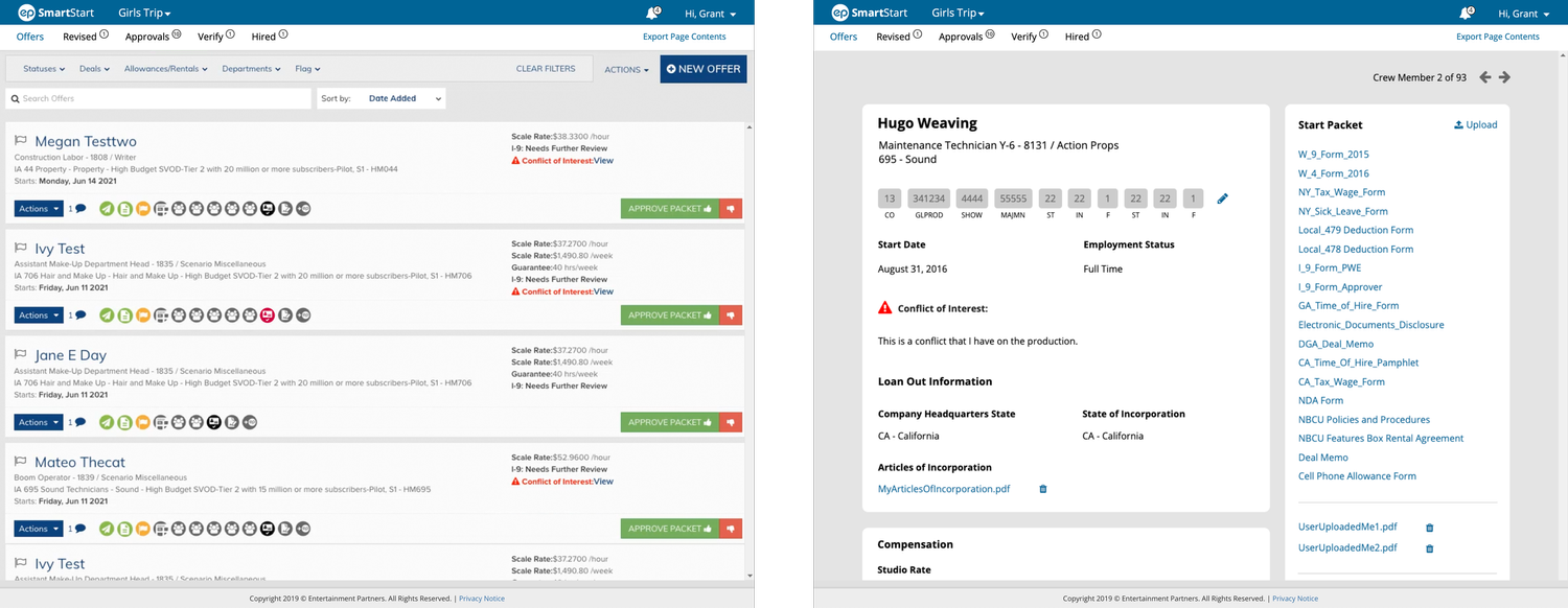
Old Design
UX Priorities for Redesign
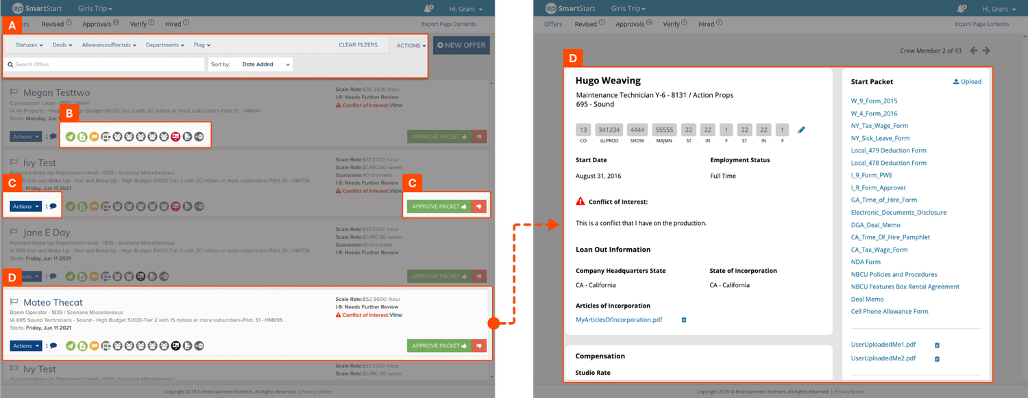
A. Search, Filter and Sort UI + Microinteractions
Placement of the Filter bar above the Search field breaks typical information hierarchy; they should be reversed. Additionally, the space taken up by the search, filter and sort functionality can be optimized to take up less, and microinteractions should be streamlined.
B. Iconography and Approval Chain Status
The icon collections used in different places within SmartStart negatively impact usability because:
- They are ambiguous and lack static labels.
- They rely upon tooltips to convey meaning—which takes time and is ineffective because the user has to hover, wait, read, and repeat for each icon.
- Color by itself is being used to convey different statuses for some of the steps in the approval chain, but that also has a cognitive cost and runs counter to accessible design guidelines.
C. CTA (Call-to-Action) Buttons
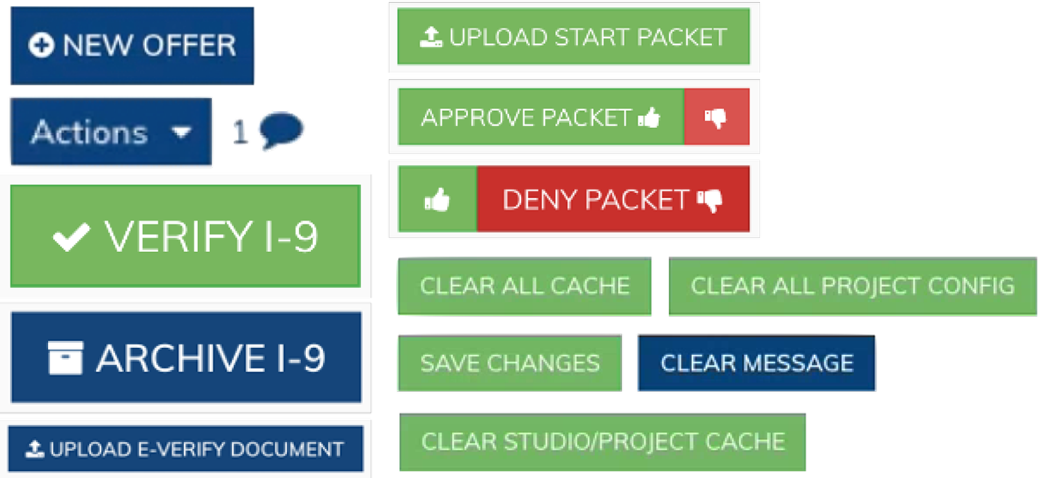
The number and variety of CTA buttons (some shown above in the screenshot, and more to the right) is bad for usability because:
- Their dark, saturated colors give each of them a lot of weight.
- There is often more than one on a screen, which means they’re all competing for attention and drawing the user’s gaze to different sections of the screen all at once.
- Their lack of proximity to one another makes it more difficult to compare, contrast and evaluate the full list of options for any given context.
D. Inconsistent Information States
Information is presented differently between the Roster List and Crew Drill Down screens, which means the user has to re-orient themselves to what information is displayed — and where — every time they click/tap back and forth between them.
The Process
Generally, the process for this and other projects would typically follow the following process:
- Sprint 0: UX Research and Requirements Gathering
- Sprints 1 – X Iterations:
- Whiteboard & Sketching
- Wireframe
- Prototype
- Weekly or Bi-weekly Reviews for Feedback:
- Frequency depends on how far along in the process a given feature is.
- Generally involves product owner, product manager, other stakeholders, developers, and QA engineers.
- Repeat
- Milestones: User Testing takes place periodically throughout the design process, with frequency dependent on budget, user availability, and other factors.
Design Iterations
1st Iteration
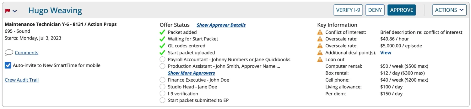
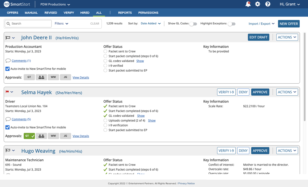
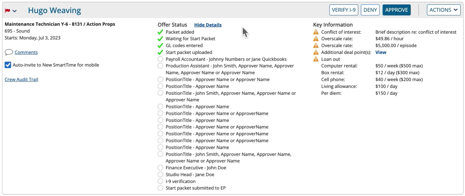
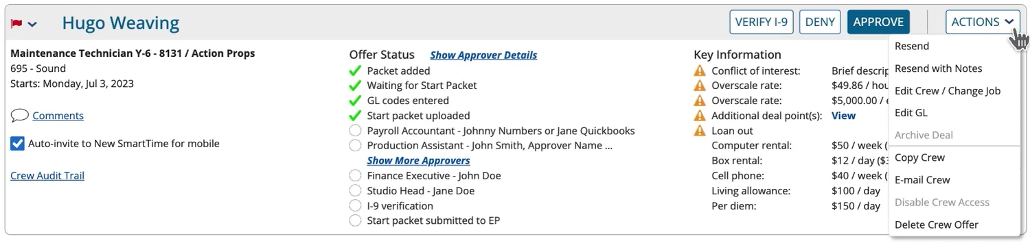
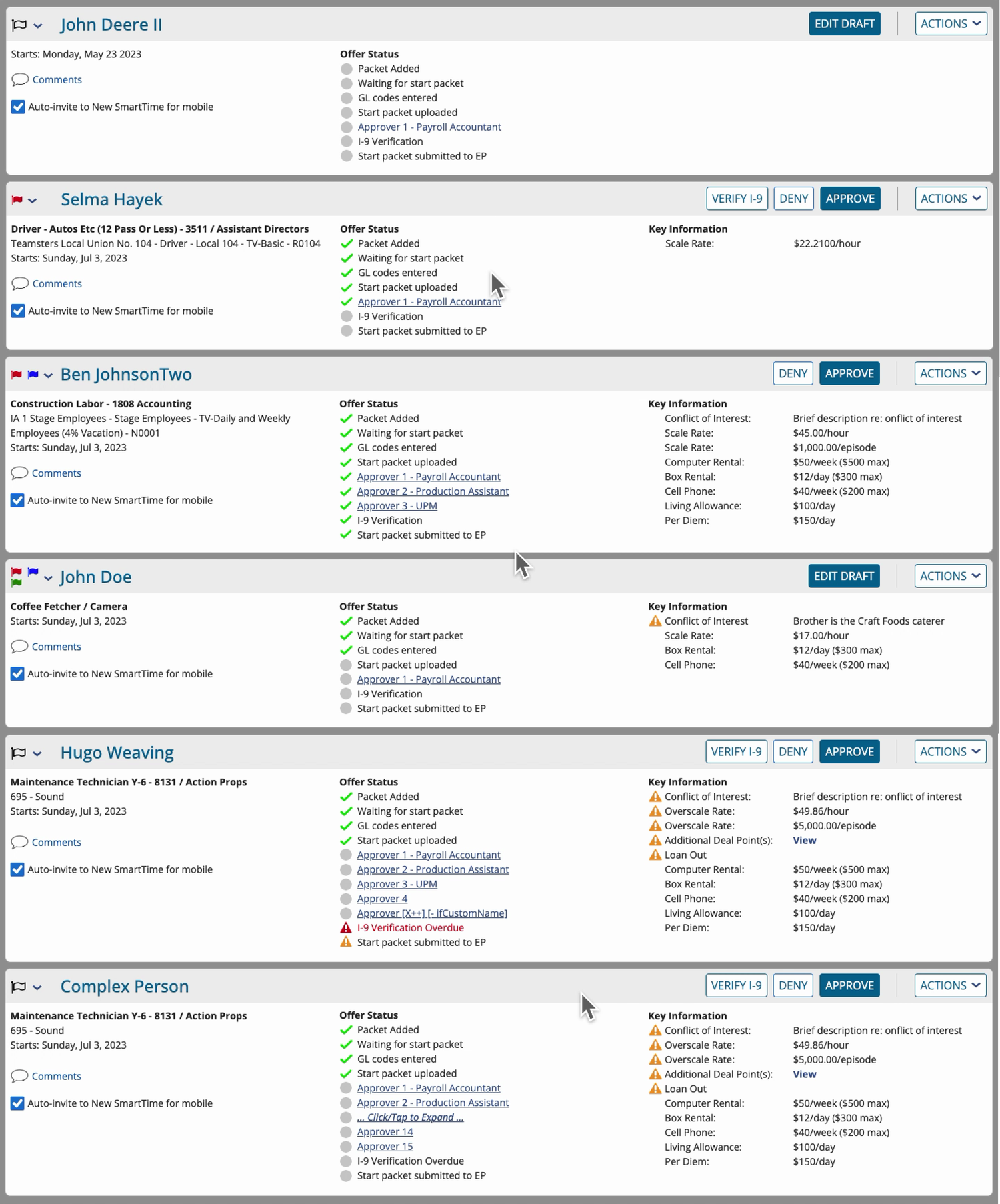
The 1st iteraton of the redesigned Roster List focused on the Crew Offer Cards themselves — being intentional around what information to display, where to display it, and how to better communicate approver chain status for any given card at a glance. Specific changes include:
- Created a card header that’s now visually distinct from the rest of the card, and it contains the status flag selector (added a caret icon to convey that it’s actionable) and crew member’s name in the top-left, and all primary/secondary CTAs with appropriate styling in the top-right.
- Divided information within the card into three columns, each with a subheader and created a grid structure to improve alignment and spacing of data points.
- Removed the offer status icons — previously horizontal — and provided a checklist-style of icons/labels in the second column under “Offer Status,” with each row containing either a step status icon and step name, or an approver.
- Up to five approvers are listed individually by role and name(s), and if there are more than five, links appear in the subheading and list itself allowing the user to “Show More Approvers.” This list would dynamically expand in place, increasing the height of the card itself on the screen.
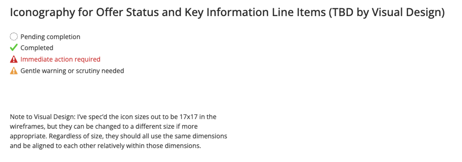
- Explored and introduced a collection of four standardized status icons that more efficiently communicate the status of each step.
- Refined how we use the warning placard icon changing its default fill color from red to marigold — in the “Key Information” column on the right. Red is now only being used for data points requiring “immediate action.”
1st Round of User Testing
Because the redesign involved some fairly major changes, from information being re-organized to the row of circular icons so prominent before being removed, it was important to get feedback from actual users on productions in the real world.
- While overall users liked the consolidation of the CTAs and reduction of “seeing red” from harsh alert icons, the “Offer Status” column wasn’t resonating intuitively with them.
- Key feedback was that name AND role for approvers wasn’t necessary, as production staff had everyone’s name and role memorized early on.
- Some users missed the row of approver icons that had been removed.
- Representing an approval chain visually was important.
- Offer Status and the Approval Chain didn’t necessarily have to be intertwined into one long list of steps.
2nd Iteration
Approval Chain Visual Explorations
Most approver chains represented visually took on the convention of circles with two-letter initials inside them — more or less borrowed from the use of circular avatars in social media sites. I did some visual explorations of this concept, with circles evolving into rounded rectangles as I pressure-tested different permutations for spacing, scan-ability, legibility, and group representation.
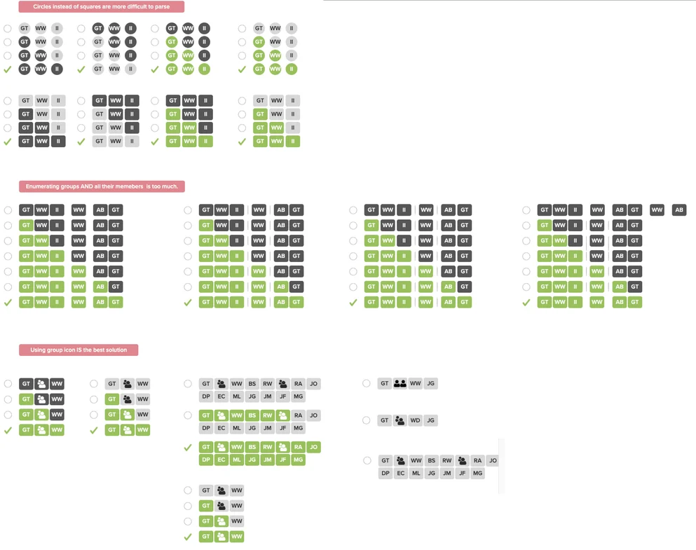
Going through this exploration, I came to the following conclusons:
- Circles are more difficult to parse than square or rectangles, because each circle edge and its interpl ay with its neighbors is cognitively more costly than rectangular edges that fall into a predictable grid pattern.
- Enumerating groups AND all their respective members is too much and quickly gets out of hand with the sheer number of rectangular icons becoming untenable.
- Using a group icon would be acceptable, so long as there’s a way to see members of that group when needed.
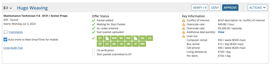
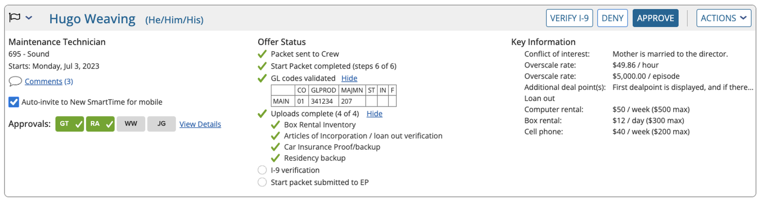
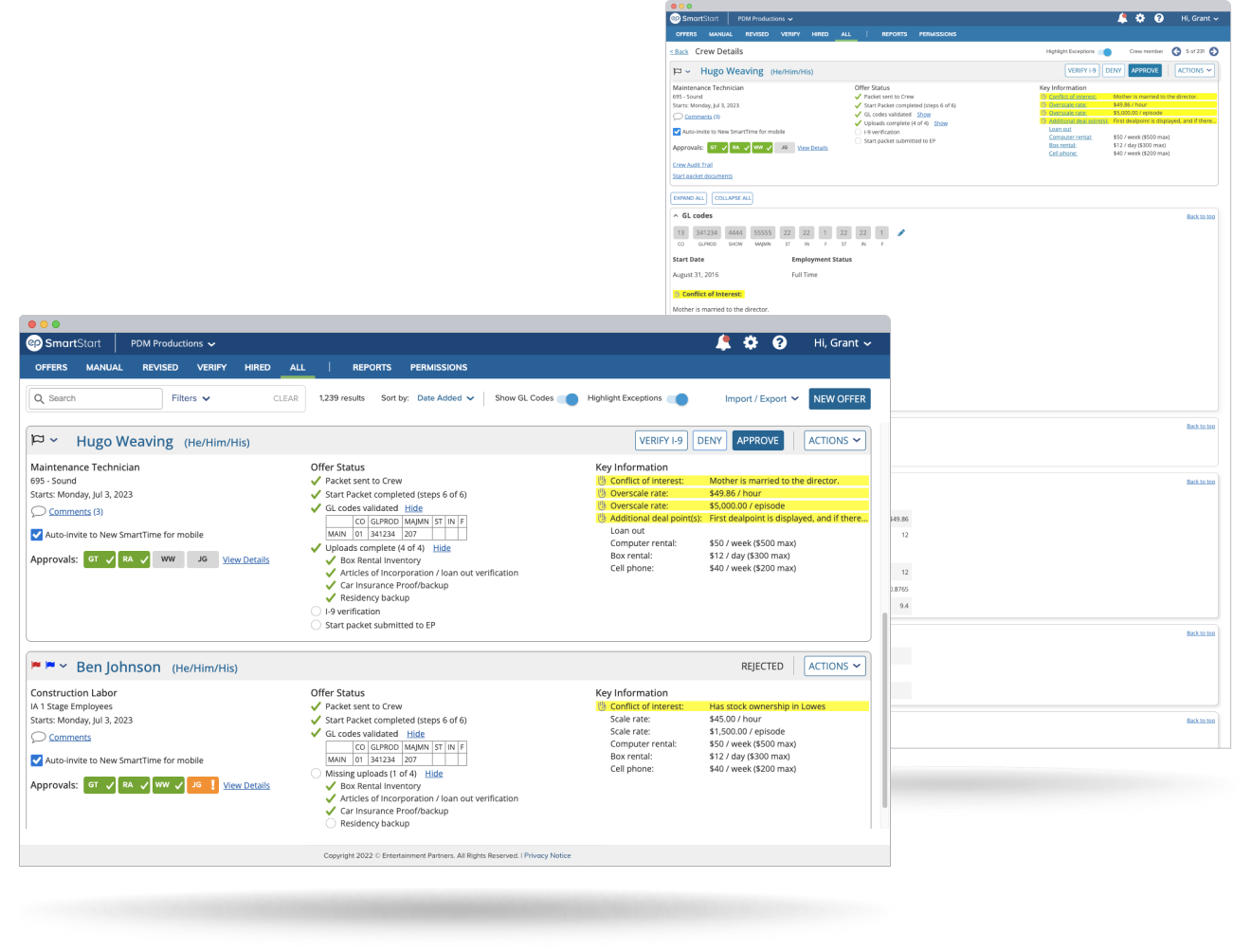
Also added “Missing Uploads” functionality in the Offer Status column, and made both it and “GL codes” dynamically able to be shown and hidden so that users didn’t have to click into the Crew Detail screen for that information.
Summary of Changes Before 2nd Round of Testing
Roster List
- Separated the approver chain from offer status. Redesigned the approver icons, using initials for individuals and a group icon to represent pools.
- Oriented them horizontally to match the same orientation used throughout other EP apps.
- Offer Status is vertically-oriented and uses descriptive labels that are dynamic, but consistent.
- Changed visual treatment for highlighting exceptions so they are less triggering.
- Added “Highlight Exceptions” toggle at the top of the screen that lets the user show/hide visual treatment en mass for all offers on the screen.
- Added “Show GL Codes” toggle at the top of the screen.
Crew Drilldown
- Changed top of Crew Drilldown to mirror the Roster List Offer Cards at the top.
- Added internal hyperlinks to let users jump to specific parts of an offer, as there is a lot of information contained in this screen.
- Formatted information into one column of expandable/collapsible cards (instead of the previous two-column layout).