
Streamlining EP SmartStart for TV & Film Productions
Redesigning crew onboarding and offer approval workflows for entertainment production managers.
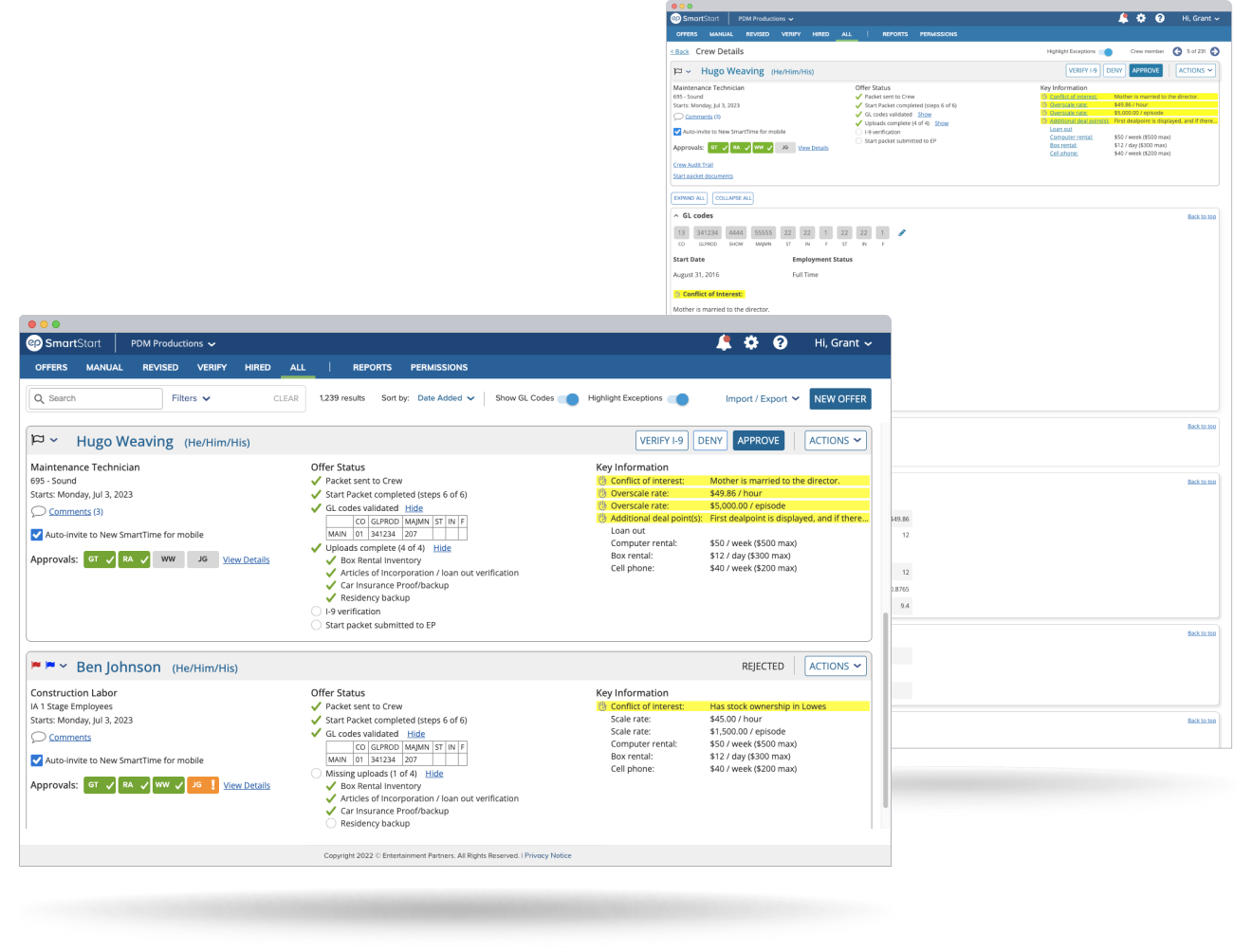
Re-architected candidate offer cards to handle complex studio sign-off chains cleanly on desktop screens.
Used findings from studio coordinators and crew members to prioritize layout updates and interaction changes.
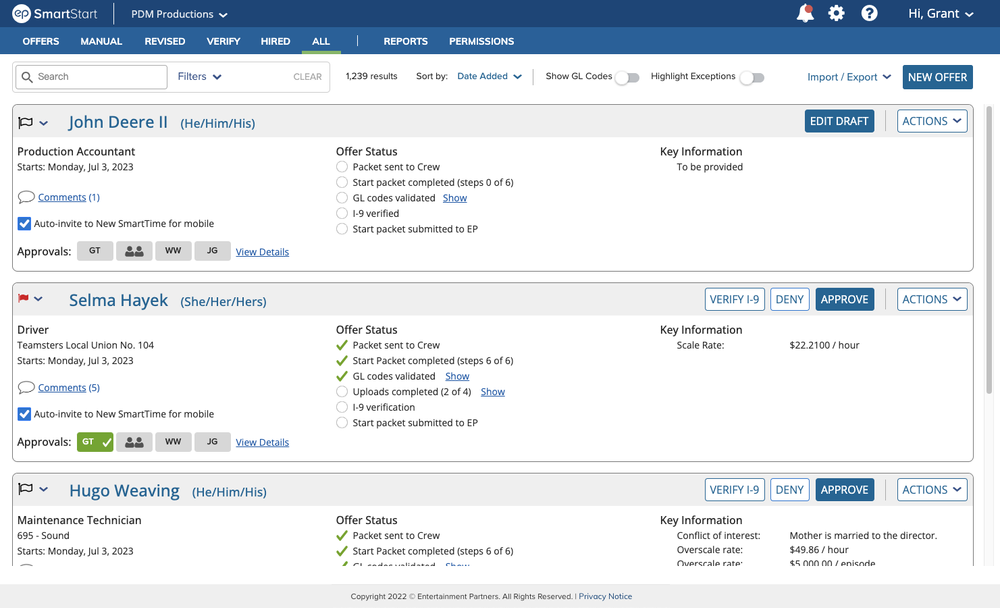
Replaced circular avatar icons with rounded rectangular badges, and separated them from the multiple line-item statuses contained within an offer, making it easier to identify approval bottlenecks and missing documentation at a glance.
Project Overview
A case study on redesigning two core screens in EP SmartStart: the Roster List and Crew Detail View. These tools are used daily by film and TV production staff to generate offer letters, verify crew details, and track approval sign-offs before production begins.
Research Context
Prior to the redesign, EP commissioned a third-party research firm (Philosophie) to conduct user interviews and map out pain points across SmartStart and related tools. I sat in on many of these sessions and used the resulting data to inform my design choices.
- Interviews Conducted: 39 interviews across EP internal stakeholders (12), studio administrators (19), and crew members (9).
- Key Output: An end-to-end journey map identifying where users experienced confusion or delays during onboarding.
My Responsibilities
- Redesign the Roster List and Crew Detail View
- Synthesize user research to prioritize UI fixes
- Re-architect candidate offer cards and approval chain layouts
- Standardize button hierarchy and search patterns
- Partner with dev teams through implementation
Team Members
- Sr. Product & UX Designer (myself)
- Product Manager
- Product Owner
- Software Engineers
- QA Leads
Auditing the Legacy Layout
A usability audit of the original SmartStart interface revealed four clear issues that were slowing down production coordinators and accountants:
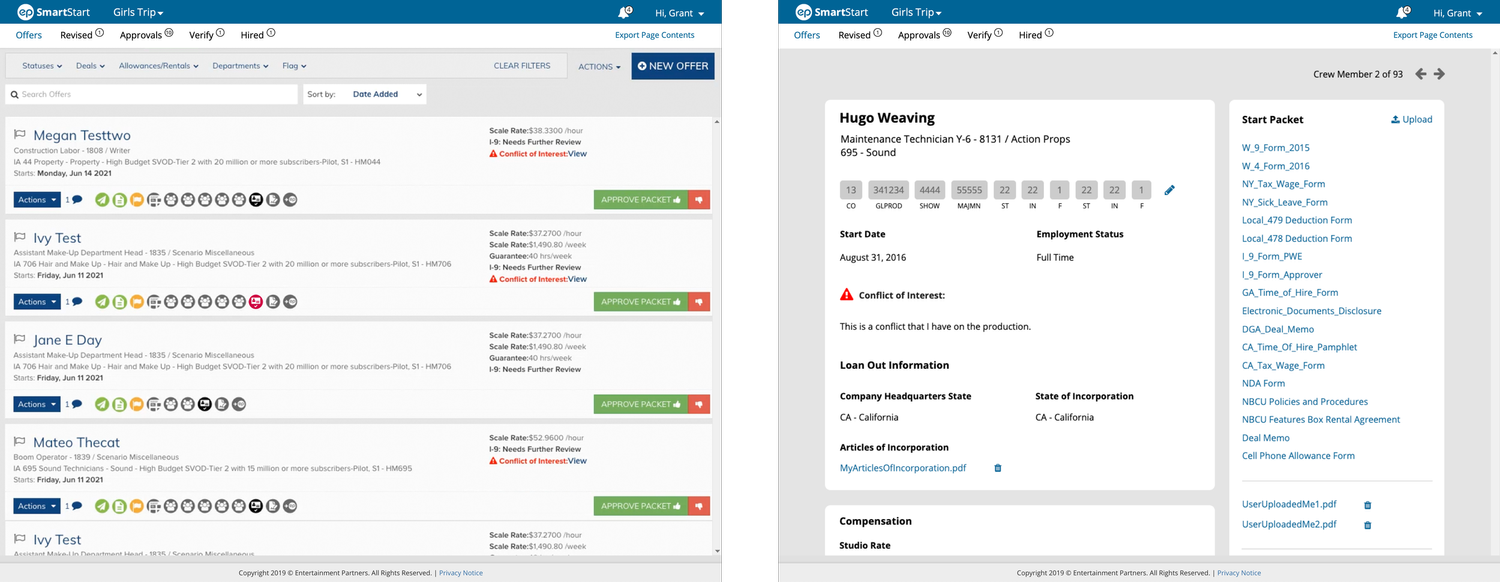
Primary Usability Problems
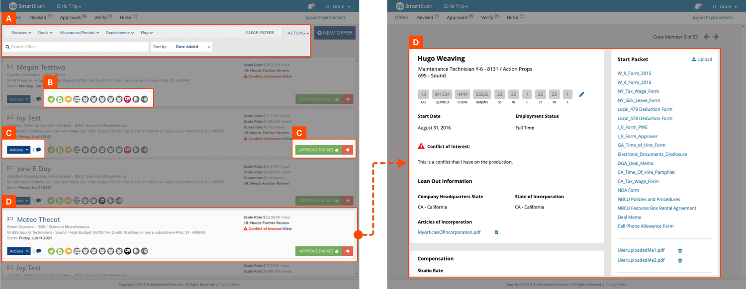
A. Inverted Search & Filter Hierarchy
Placing filters above the main search bar broke standard visual hierarchy. The search controls also took up too much vertical screen space.
B. Ambiguous Icons & Color Reliance
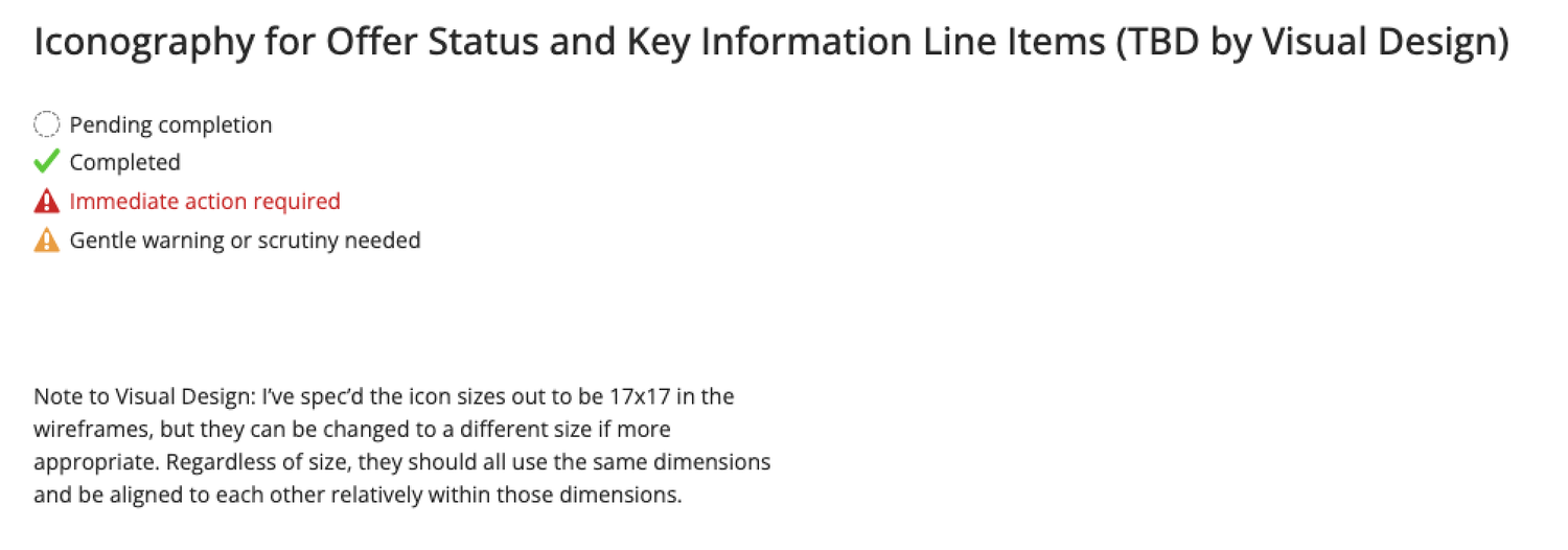
Status icons lacked visible text labels, forcing users to hover for tooltips. Using color alone to indicate approval stages created accessibility issues.
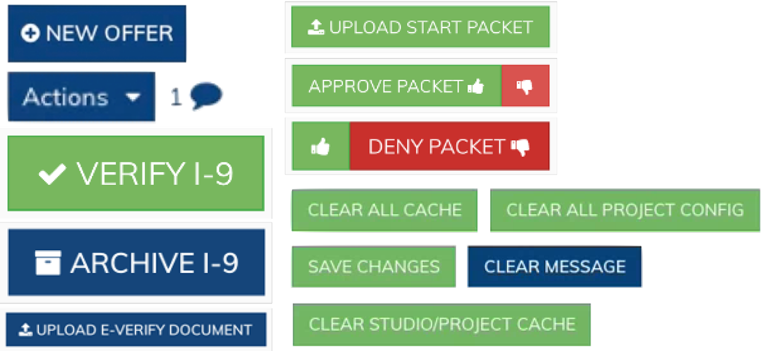
C. Button Clutter
Too many competing dark button styles were scattered across each card, making it difficult for users to scan and compare primary actions.
D. Layout Disconnect Between Views
Key candidate data was organized differently between the master list and detail pages, forcing users to relearn the layout when clicking through.
Design Process & Team Reviews
I worked in bi-weekly design sprints, sharing whiteboard sketches, wireframes, and interactive prototypes with product leads, developers, and QA engineers for early feedback before user testing.
- Sprint 0: Research Review & Requirements Gathering
- Sprints 1–3: Wireframing, Layout Explorations & Prototyping
- Bi-Weekly Team Reviews (Product, Dev, QA)
- Usability Testing & Design Revisions
- Development Handoff & QA Support
Rethinking the Candidate Offer Card
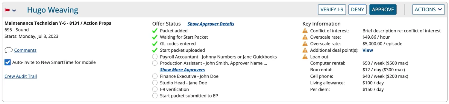
My first priority was restructuring the core Offer Card component. I separated primary candidate details from secondary actions, establishing a predictable 3-column layout that scales cleanly across screen sizes.
Key structural changes included:
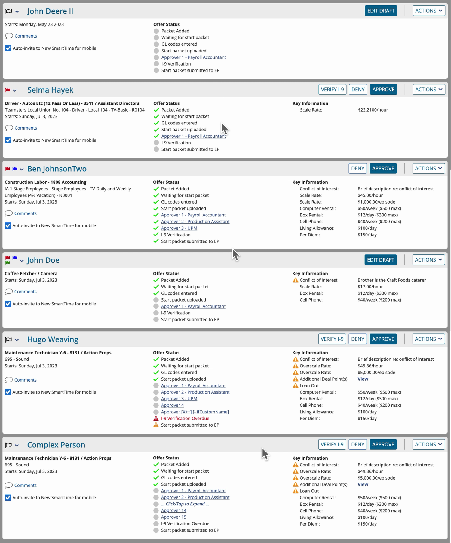
- Clean Header Layout: Placed candidate name and job title on the left, moving primary offer status and action buttons to a top-right cluster (Figure 4).
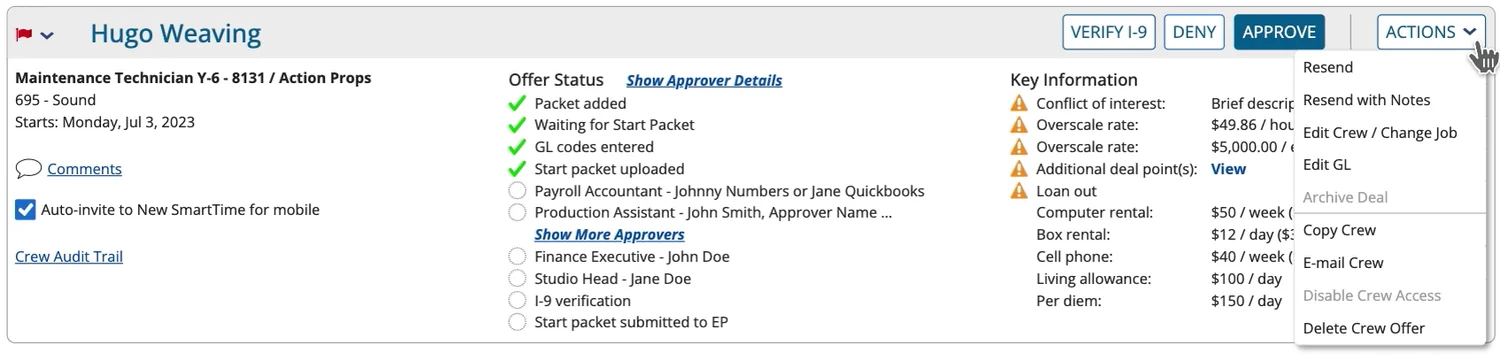
- Action Dropdown Menu: Consolidated secondary utilities into a single “Actions” menu to eliminate button clutter (Figures 5 & 6).
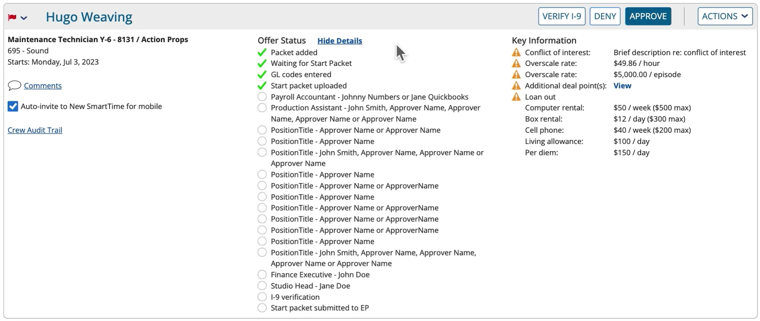
- 3-Column Data Alignment: Organized rate terms, start dates, and deal notes into three distinct columns with clear section headers (Figures 7 & 8).
- Softened Warning Badges: Replaced harsh red alert fills with balanced amber placards for non-critical warnings, saving red strictly for required actions (Figure 7).
Usability Test Feedback (Round 1)
Coordinators appreciated the cleaner card layout and reduced red warning boxes, noting that primary actions were much easier to spot.
Testing showed that listing every approver’s full name on the card took up too much space, as coordinators already knew team members by role.
Designing for Multi-Tier Approvals
A major design challenge was displaying approval progress for large studio productions requiring up to 15 sign-off stages. Many consumer apps use stacked circular avatars for groups, but in high-density enterprise tables, circular tracks create irregular spacing gaps that make fast scanning difficult. I explored several badge geometries to improve legibility.
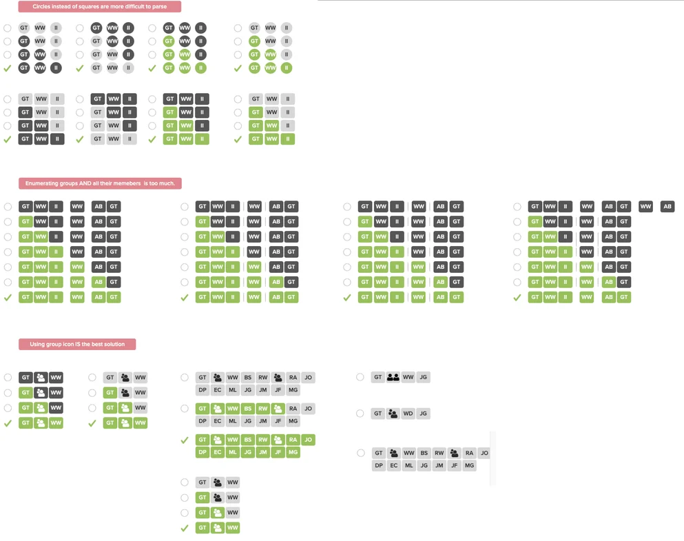
Key insights from visual explorations:
- Linear Rectangles Are Easier to Scan: Rectangular badges align cleanly in grid layouts, allowing the eye to sweep across status stages faster than circular icons.
- Group Tokens Prevent Bloat: Showing 15 individual badges on a single card creates visual clutter. Collapsing approval stages into consolidated group tokens keeps cards readable while allowing users to hover or click for details.
- Checkmarks for Accessibility: Added explicit checkmark icons inside completed approval badges so status doesn’t rely on color alone.
Summary of Design Improvements
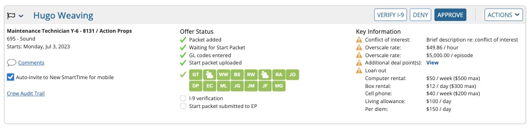
Roster List View
- Separated the approval progress chain into a clean horizontal row.
- Used rectangular group badges with explicit checkmarks for better scanability and accessibility.
- Softened background alert fills to reserve high-contrast red strictly for required actions.
- Added global filter toggles at the top of the list to let coordinators quickly highlight missing documents.
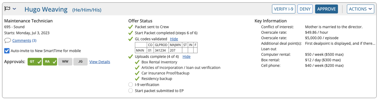
Crew Detail View
- Matched top header card layout to the Roster List view for visual consistency.
- Added section jump links so coordinators can skip directly to specific offer terms.
- Reorganized content into single-column collapsible cards for better readability.
Engineering Handoff & Results
To ensure the redesigned components were implemented as intended, I partnered closely with development and QA leads throughout production. I provided interactive prototypes and explicit layout specs for component states, edge cases, and responsive breakpoints, preventing guesswork during front-end builds.
The updated designs successfully addressed the core usability issues identified in research, contributing to a 45% reduction in support calls related to offer management and giving production staff a faster, clearer tool for daily onboarding tasks.