Simplifying Patient Control of Complex Medical Devices
Led UX design and FDA accessibility compliance to design a patient-empowering mobile experience for Nevro’s medically-regulated stimulator.
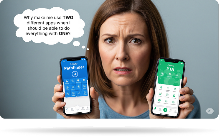
Advocated combining two planned separate apps into a single interface, avoiding fragmented patient experience and technical debt.
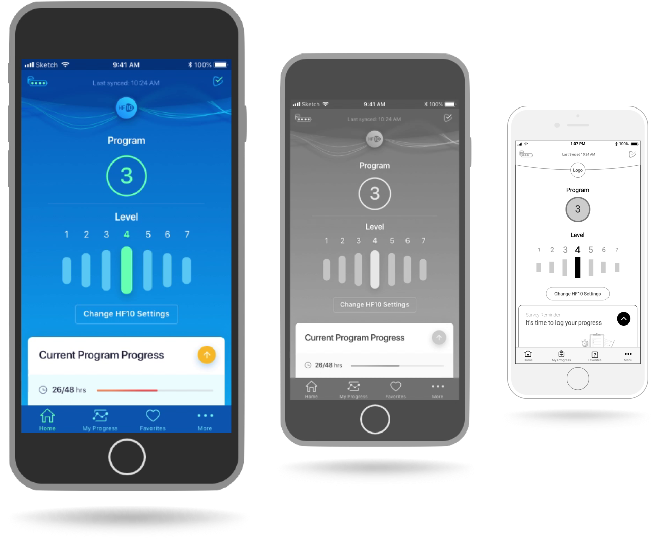
Designed screen-reader navigation patterns and high-contrast views required for FDA certification.
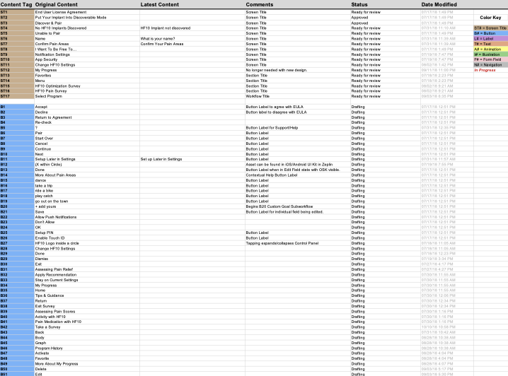
Created an annotation tagging spec that allowed copy to run on its track independent of design, so that design approvals wouldn’t be held up by client copy revisions. This allowed us to continue meeting project milestones on time, and made our regular review sessions run more smoothly.
Designed clear visual transition animations and screen states to account for delays between the phone app and the implanted device.
Project Overview
This case study details the user experience (UX) design process for the Nevro Patient Therapy App (PTA) and Pathfinder applications. Developed in collaboration between Karten Design and Nevro with Velentium as the development partner, these applications aimed to provide patients with enhanced control and insights into their HFX implant therapy. The project focused on creating intuitive interfaces for managing stimulation, tracking progress, and receiving personalized recommendations.
Project Duration: Feb 2018 – October 2018
My Role
- Sr. UX Designer (owning end-to-end design strategy)
- Research synthesis & user journey mapping
- Systemic Information Architecture
- Interactive Axure prototyping & technical spec documentation
- Centralized alphanumeric content inventory management
Team Members
- Project Lead
- Sr. UX Designer (myself)
- UI Designer & Sr. UX Researcher
- Project Manager
Design Roadmap
Our design process was iterative and collaborative, comprising of an initial 3-month design sprint followed by six bi-weekly sprints. We had weekly reviews for continuous feedback from Nevro and Velentium. Key phases included:
- Information Architecture & User Flows: Mapping core navigation pathways for onboarding, daily therapy adjustments, and pain logging.
- Wireframing & Visual Design: Building low-fidelity structural layouts in tandem with a visual designer who established the production UI language.
- Spec Documentation & Content Inventory: Tagging wireframe elements with a permanent alphanumeric ID system linked to a master copy directory.
- Interactive Prototypes were created throughout all the phases as needed.
Product Strategy: Consolidating Two Apps Into One
Patients using the Nevro HFX implant for chronic pain needed a reliable mobile app to adjust therapy programs and log daily outcomes. aInitially, the client requested two separate apps:
- Nevro PTA (Patient Therapy App): A manual remote-control app for daily stimulation adjustments and basic pain tracking.
- Nevro Pathfinder: An automated recommendation tool that suggested new program settings based on logged survey data.
Having two standalone apps for the same medical hardware presented clear usability issues: patients would have to switch between apps to manage a single device, creating confusion and doublingsengineering maintenance. I recommended merging both toolsets into a single, unified application structure, simplifying the experience for patients and reducing long-term code complexity.
Core UX Priorities
- Clarity: Simplifying complex medical device controls into clear, recognizable interface patterns.
- Patient Engagement: Making daily pain journaling feel quick and rewarding without overwhelming the user.
- Accessibility (FDA Requirement): Structuring the DOM hierarchy to fully support screen readers and dynamic text sizing.
Onboarding & Hardware Pairing
The initial setup flow was critical for a smooth patient onboarding experience. Key steps included:
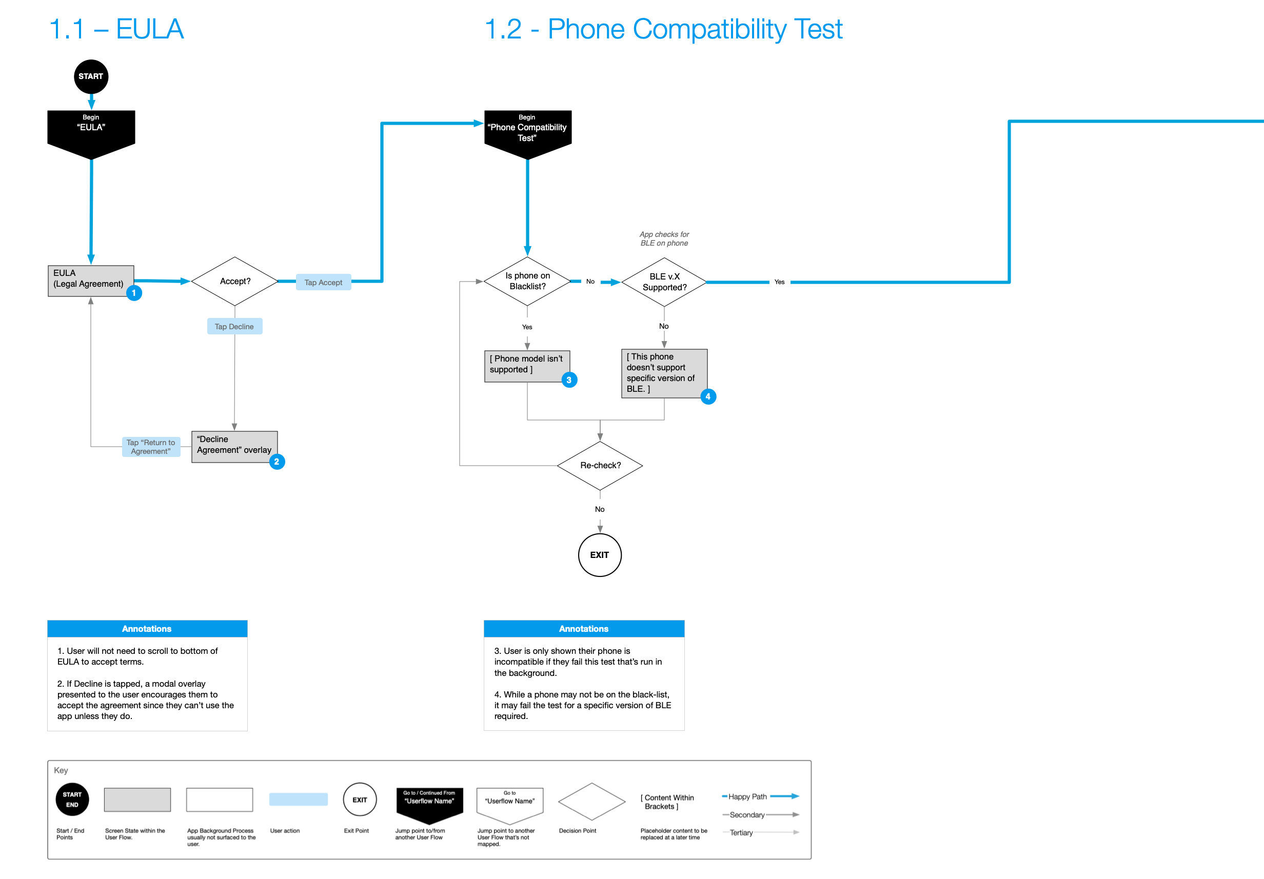
- EULA Acceptance – Ensuring required medical disclaimers were read and accepted.
- Compatibility Check – Verifying the phone’s operating system and Bluetooth version supported the implant hardware.
- Bluetooth Discovery & Pairing – Guiding the user through searching for and pairing with their implanted device.
- Profile Setup – Personalizing therapy goals and selecting target pain areas.
- Push Notifications – Setting up gentle reminders for daily pain surveys.
- App Security – Adding PIN and biometric protection to prevent accidental adjustments.
Onboarding User Flows
Use the arrows below to browse through the onboarding wireflows.
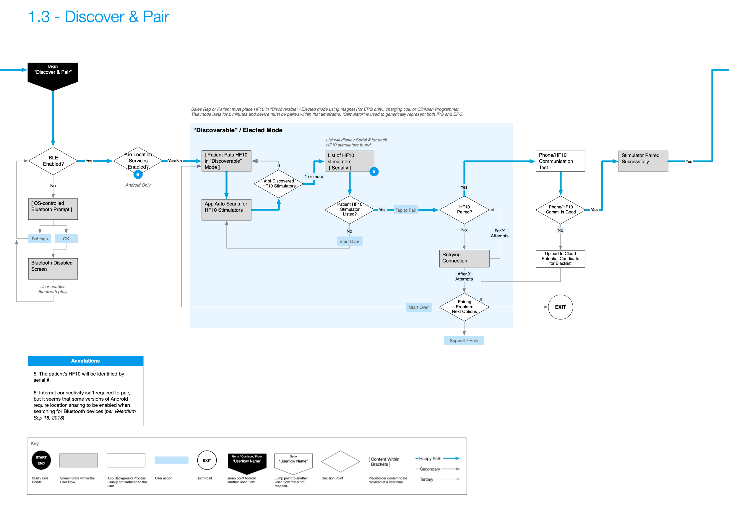
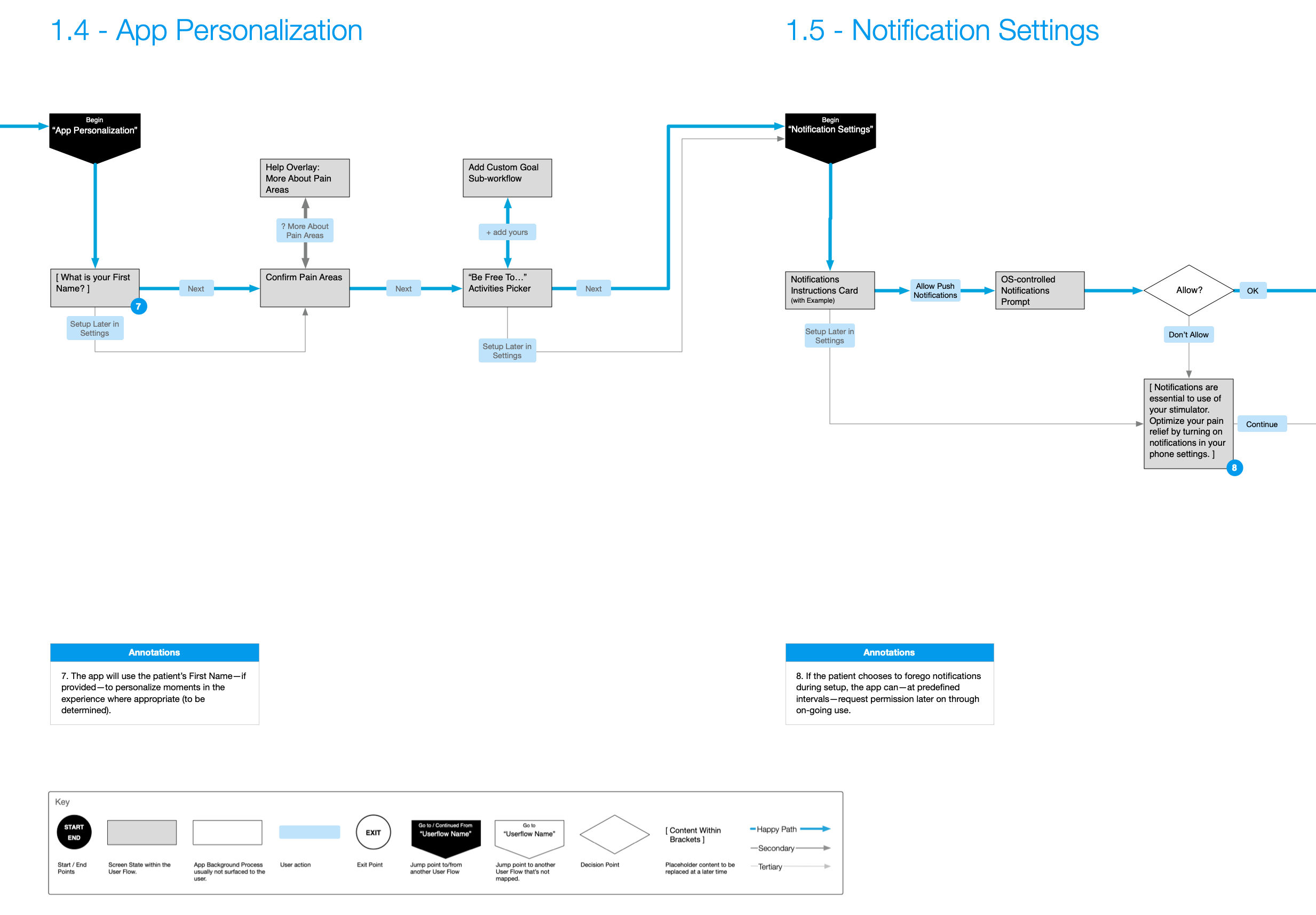
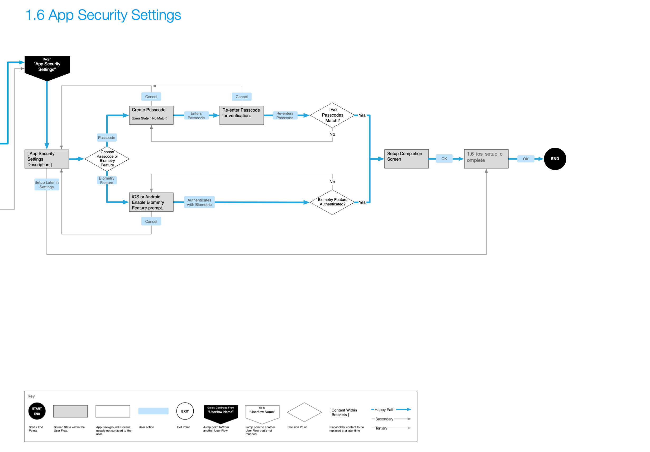
Testing the Onboarding Flow
Below is an early prototype walkthrough demonstrating how we tested the Bluetooth setup and hardware pairing flows with users.
Final UI: Bluetooth Pairing States
Following prototype feedback, our visual designer created step-by-step animations and UI states to guide patients clearly through hardware pairing.
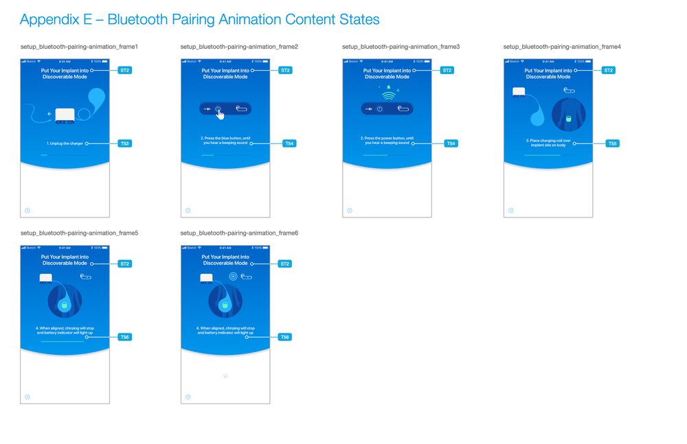
Designing Around Physical System Latency
When a patient adjusts stimulation levels in the app, there is a physical delay while the phone sends the Bluetooth signal to the implanted device and receives confirmation back. To prevent patients from tapping repeatedly or worrying that the app froze, we designed explicit loading transitions that clearly show signal progress during these delay windows.
Stimulation Controls & Feedback States
Data Visualization & Pain Progress Tracking
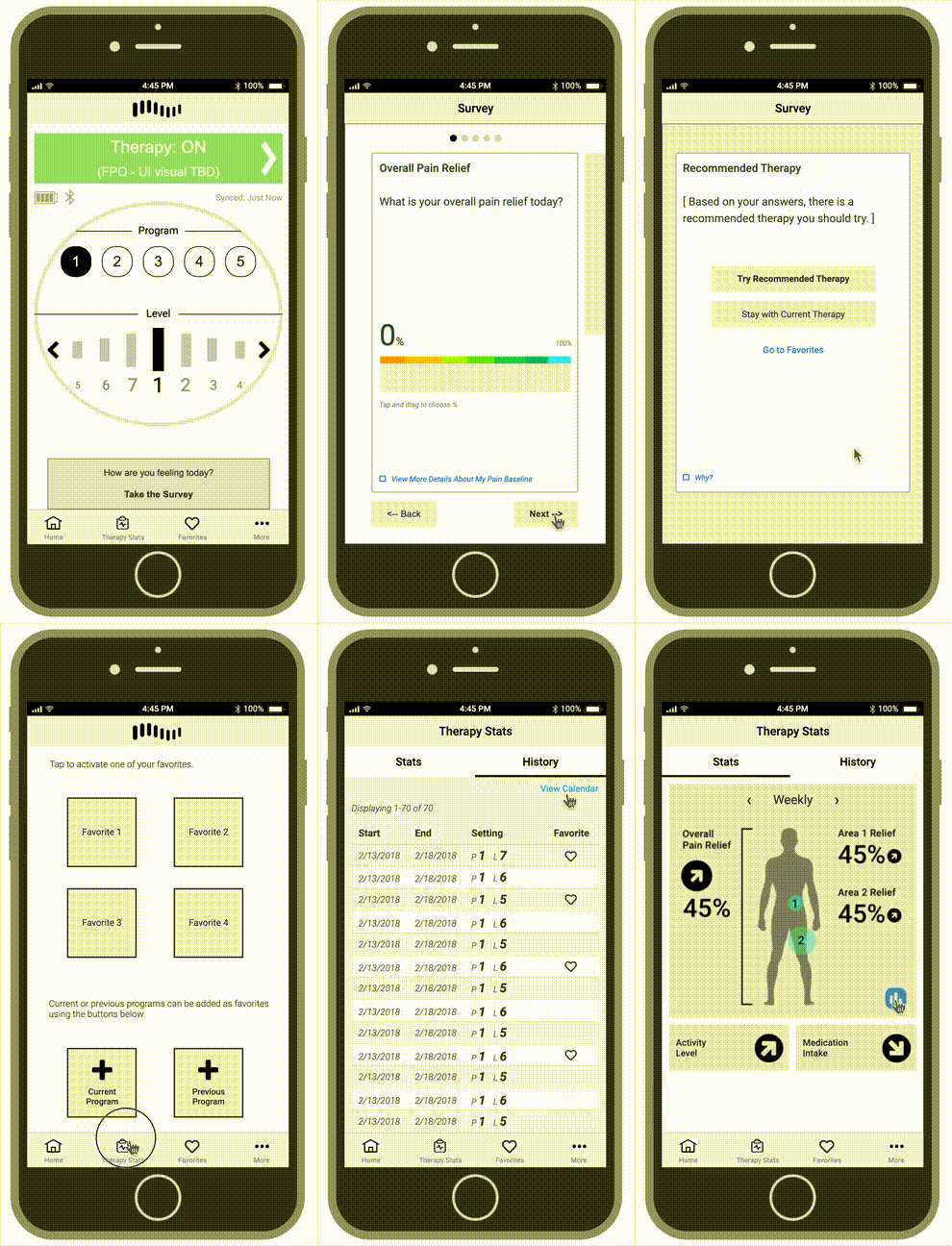
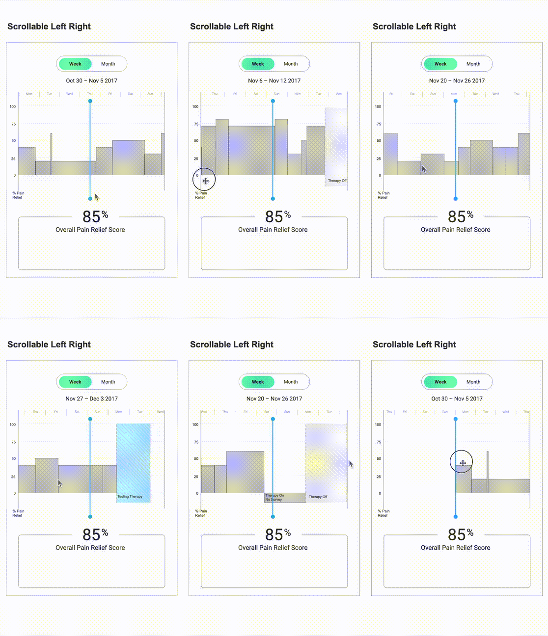
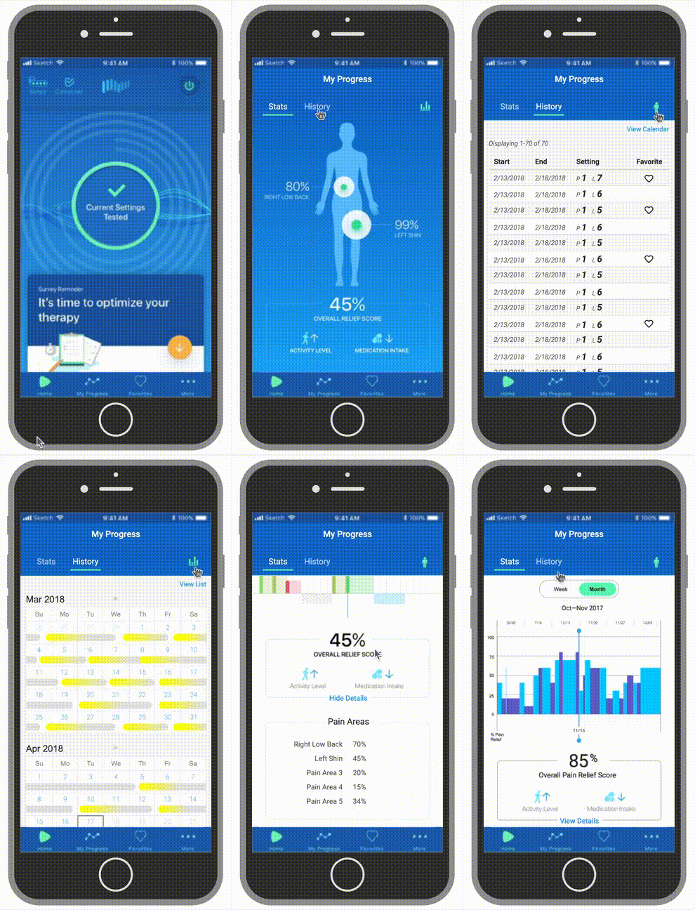
To give patients useful feedback on how their treatment was progressing, we designed clear data summary screens showing pain scores over time.
Below are three early prototype variations we tested to evaluate different graph layouts and scrolling behaviors:
Timing Prompts Around Treatment Cycles
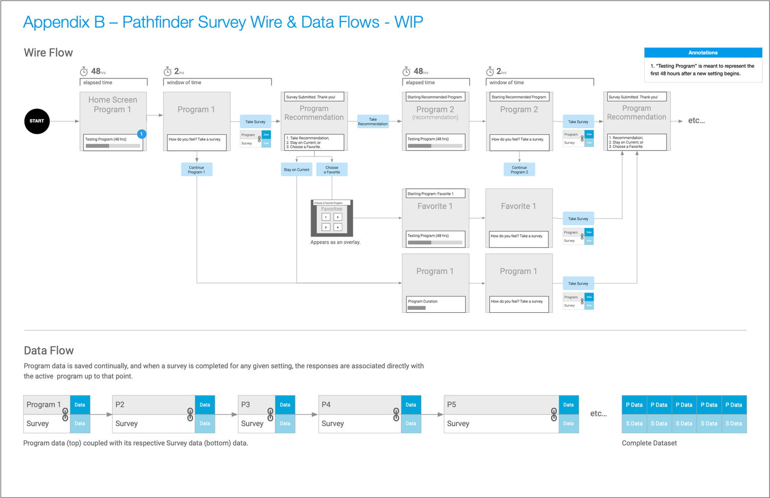
Implanted spinal stimulators require roughly 48 hours for a patient’s body to adjust to a new setting. Prompting a patient for a pain survey right after a setting change yields inaccurate data. To address this, the UI suppresses survey prompts during the 48-hour adjustment window, then displays a clear survey banner on the home screen when it’s time to log feedback.
Survey Flows & Screen States
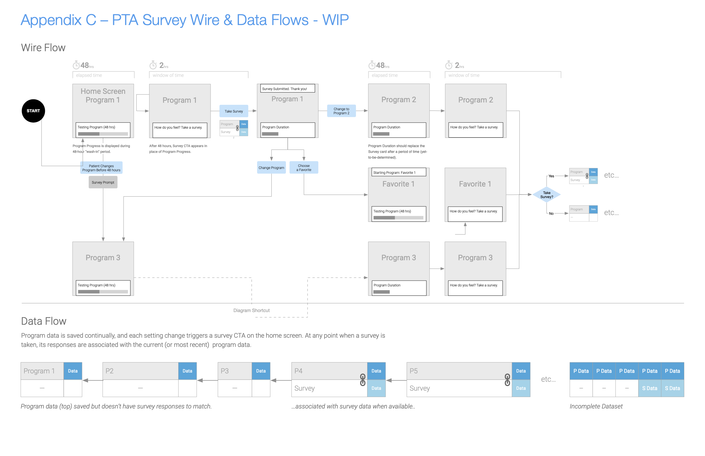
Home Screen Survey Prompts
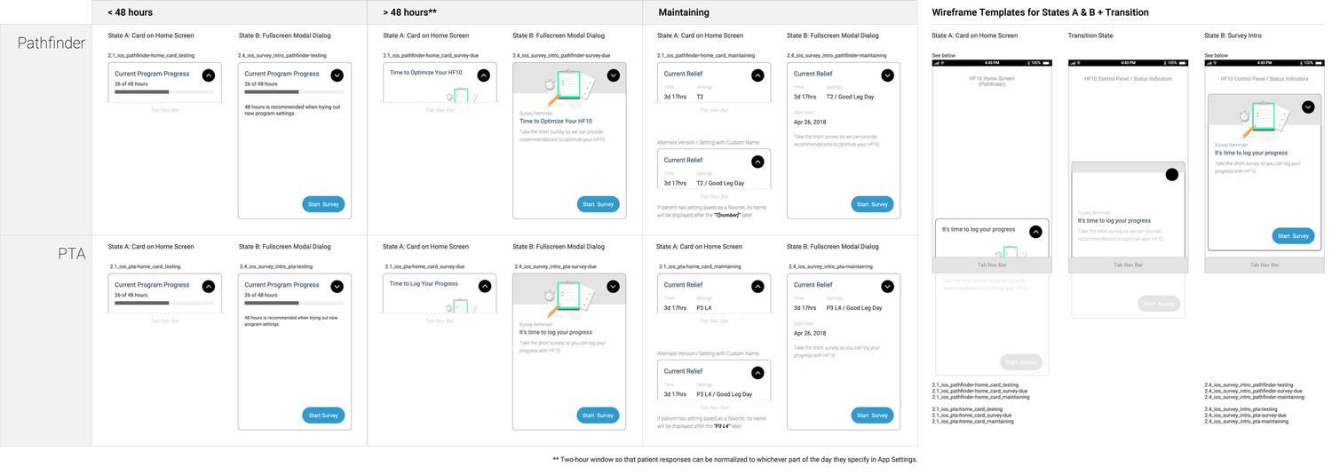
Survey Wireflow Map
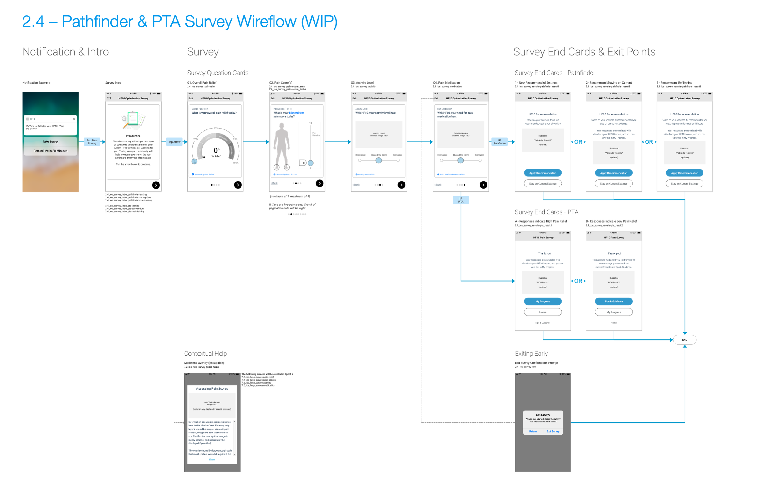
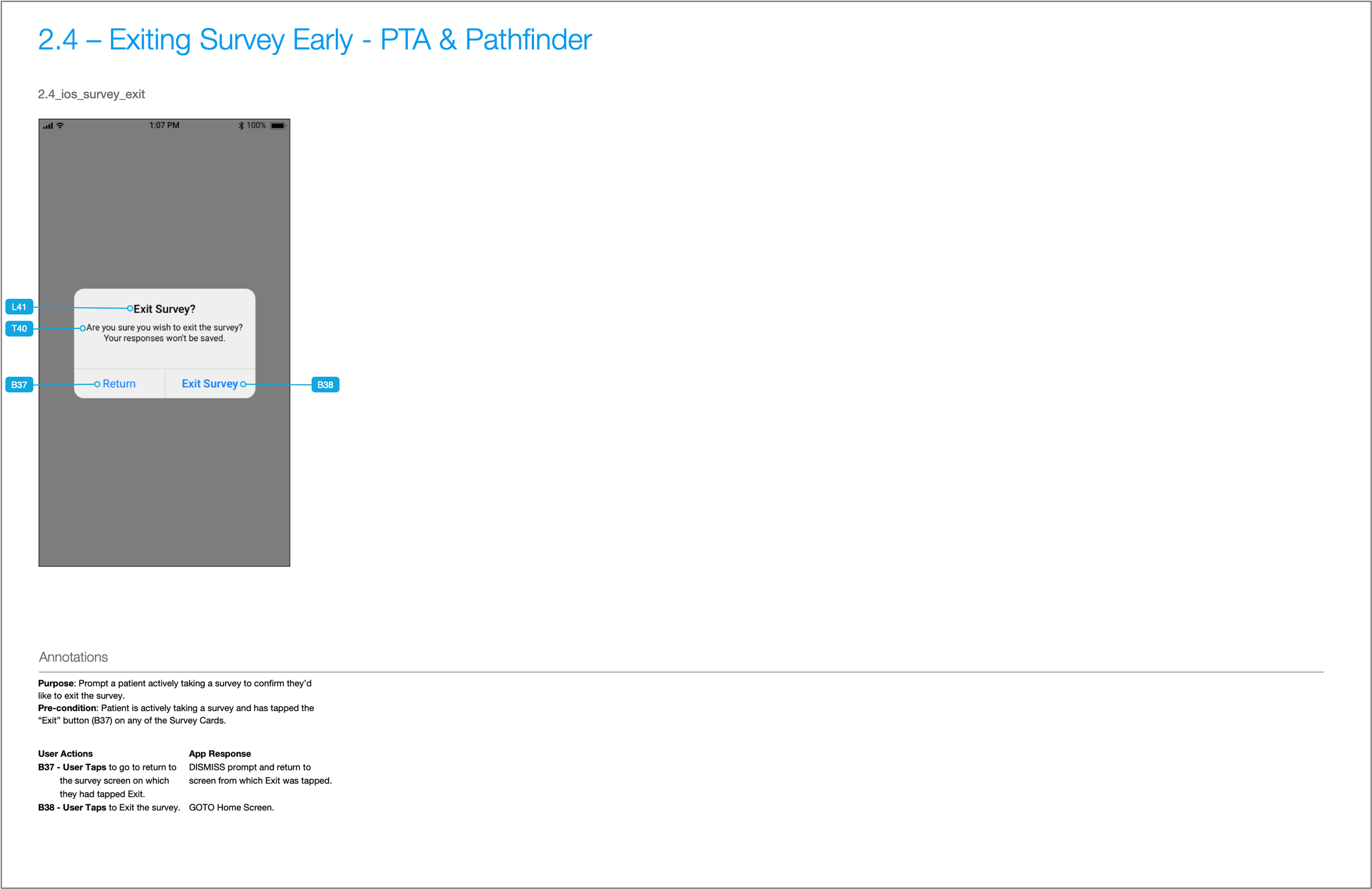
Survey Cards & Exit Confirmations
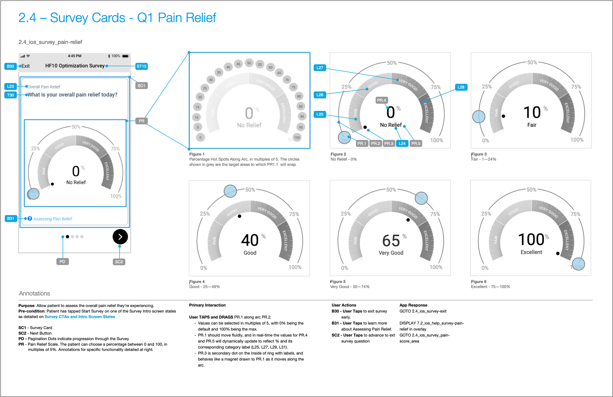
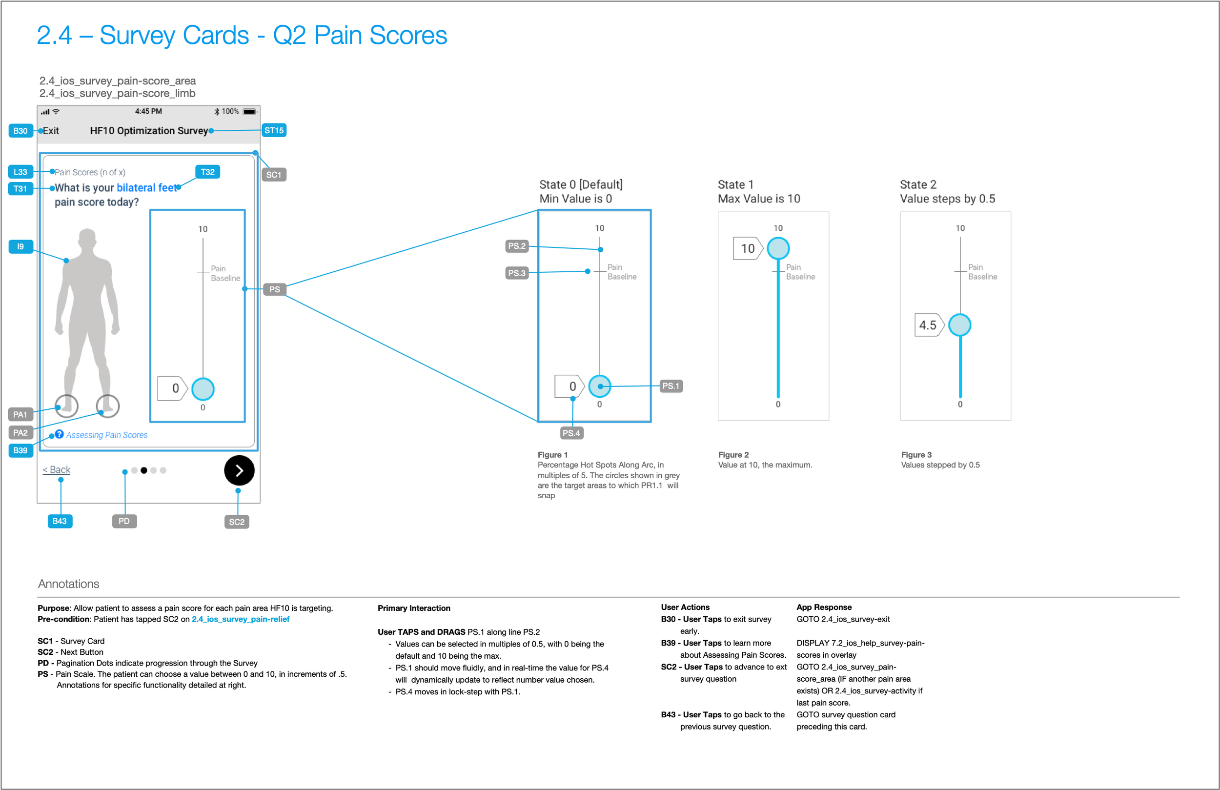
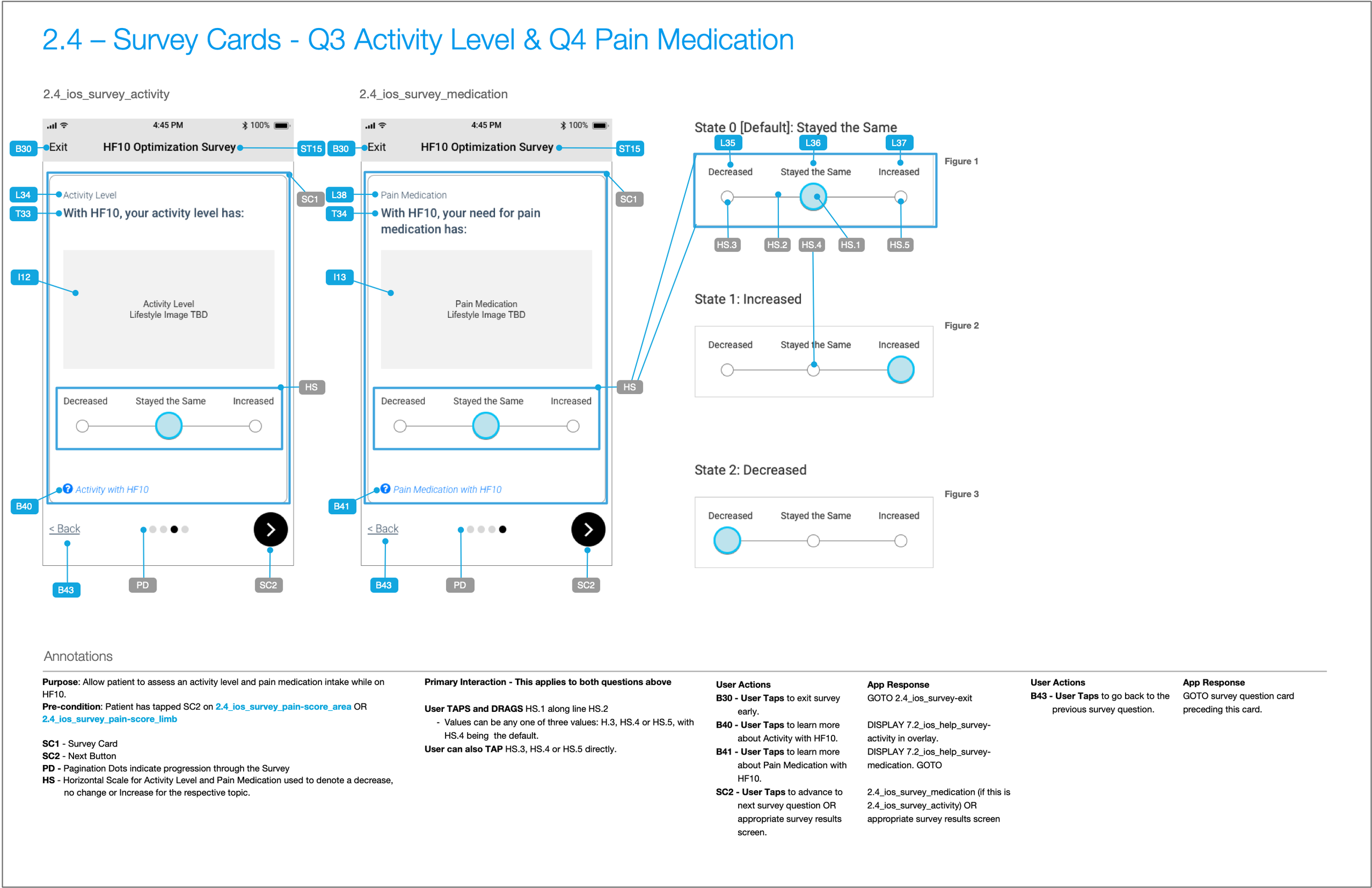
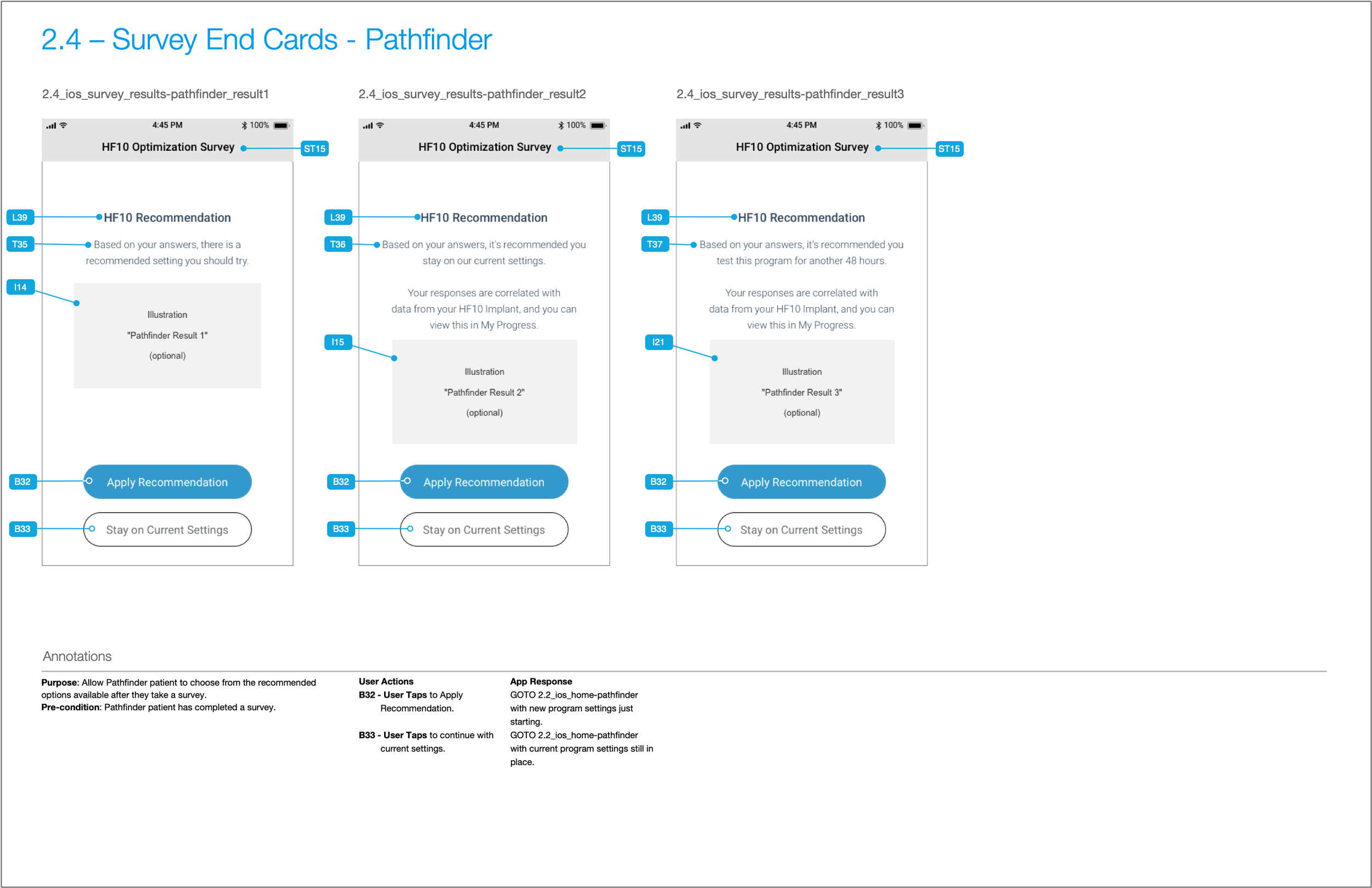
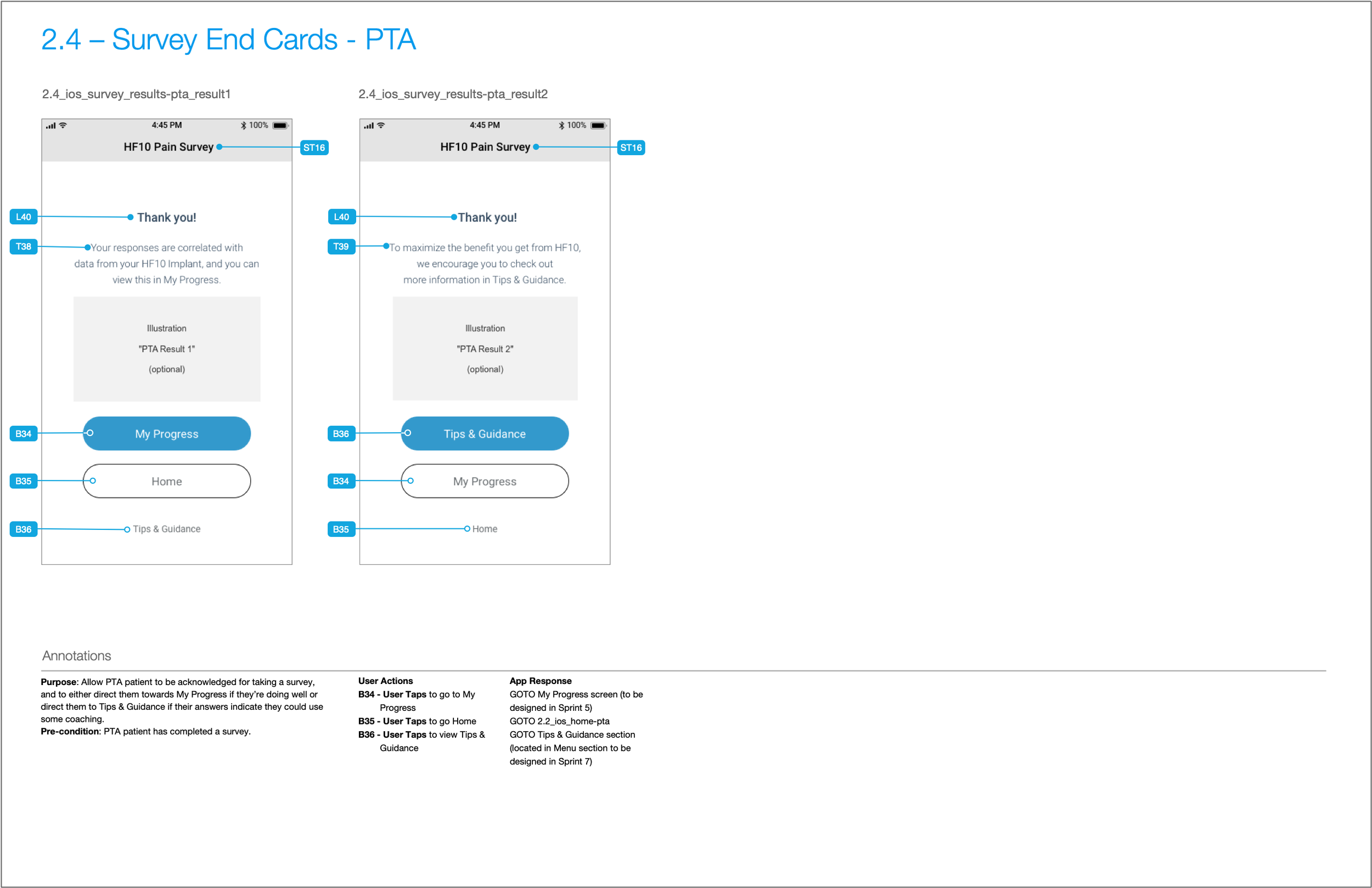
Hardware State Alerts
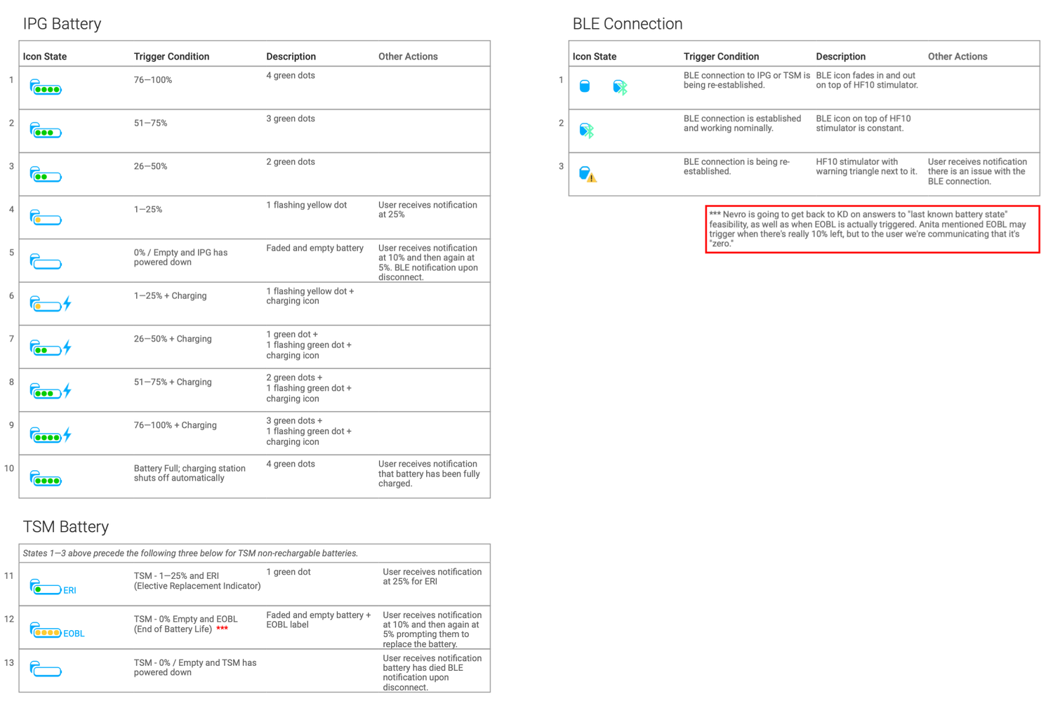
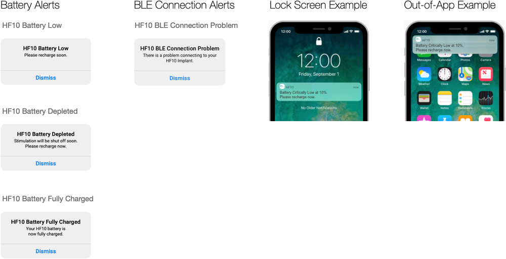
Device alerts—such as low battery or lost Bluetooth connection—are displayed cleanly in the app header and via OS push notifications.
Creating a Content Inventory to Prevent Schedule Slippage
In medical software, interface text and safety disclaimers go through continuous legal and clinical review. Updating text strings directly inside design files during early sprints created unnecessary bottlenecks for our stakeholders at Nevro and our development partners. Our design reviews were getting bogged down by copy changes, and we are at risk for schedule slippage.
To mitigate this risk, I created a content inventory system in SmartSheet using their standard Grid sheet (for the annotation IDs and copy) and their newly-released approval automation feature.
Every single piece of content was defined and defined using the following format:
- ST# = Screen Title
- B# = Button
- L# = Label
- T# = Text
- A# = Animation
- I# = Illustration
- F# = Form Field
- N# = Navigation
…and each unique annotation ID marker in the wireframes had a correspondng row in SmartSheet.
This allowed us to completely decouple copy approvals from the design track, getting us back on schedule and making life easier for developers, as well. Medical and legal could update wording directly in SmartSheet without requiring designer edits to the wireframes and UI design files on a weekly basis.
This approach also makes it much easier to implement multi-lingual and localization features, which are required for compliance with FDA regulations.